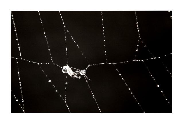
This was shot around 4:30/5:00, after a first attept the previous day. I sprayed the spider web with a spray bottle, and set up a 150 watt, er maybe a 250 watt, Im not quite sure, but it's a construction light. The idea behind this initially was to have the small water droplets appear as the main subject. I was also trying to avoid the dead bugs in the web at first. I also used a piece of a black binder to act as a background for the shot. The difficult part was angling the binder the right way as to minimize the glare of the light, and offer a black enough backdrop. Then after a few shots, I realized the the mosquito was a much better shot than the water droplets, so I points my lens at them. It took only 4 shots to get this one.
I cropped it, discarding almost half of the image, I played around with the brightness and contrast, and then altered the sat., tint and hues, and then finally converted to nearly b/w. The contrast is really high, but I think it all balances out. I then added the borders, and saved for the web.
I hope you like it,
Thanks in advance, dpc'ers.
---------------
File Name
IMG_6775.JPG
Camera Model Name
Canon EOS DIGITAL REBEL
Shooting Date/Time
4/25/2005 4:57:11 PM
Shooting Mode
Aperture-Priority AE
Tv( Shutter Speed )
1/20
Av( Aperture Value )
5.6
Metering Mode
Evaluative
Exposure Compensation
0
ISO Speed
100
Lens
18.0 - 55.0 mm
Focal Length
55.0 mm
Image Size
3072x2048
Image Quality
Fine
Flash
Off
White Balance
Custom
AF Mode
AI Focus AF
Parameters
Contrast +2
Sharpness +2
Color saturation -2
Color tone -2
Color Space
sRGB
File Size
1610KB
Drive Mode
Self-Timer Operation
Statistics
Place: 236 out of 492 Avg (all users): 5.2331 Avg (commenters): 5.3571 Avg (participants): 5.0161 Avg (non-participants): 5.4706 Views since voting: 813 Views during voting: 467 Votes: 356 Comments: 15 Favorites: 1 (view)
I think that I'd like this better without the bug. But then you'd probably have to shoot this closer to the web to render it recognizable. The border is a little thick, but I like it.
Very nice picture, although I feel the main subject is too small (or maybe I just need some glasses...). Anyway, I like the overall feel of the image. What I truly dislike is the large border and believe the picture would be greatly enhanced if you eliminated it.
Sorry, but the focus on the subject is so soft I'm not sure what I'm looking at. I assume a spider is feasting. Love the dew on the web against the black. Don't know, but I think the border is a bit too wide for my taste. Second pass--bumping up.






 Add photograph to your favorites
 Add photographer to your favorites


 Photographer found comment helpful.


