Greetings fromt the Critique Club Hi ladpupmoe, nice to meet ya!
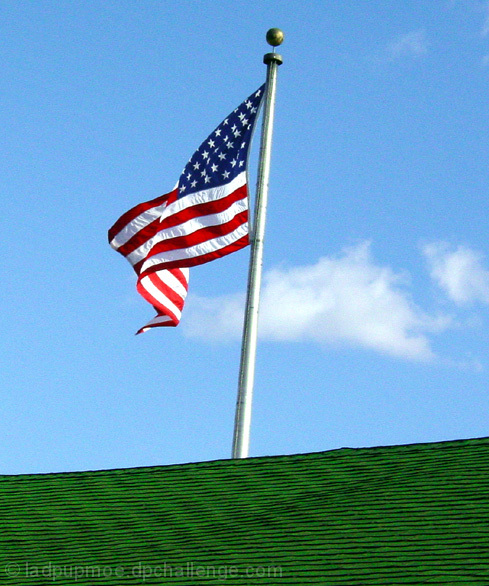
Composition Two things and they were both already mentioned - I'd flip the image and straighten the pole. Also - what if you caught a bird sitting atop the building at the same time? Something to give the picture character? I'd have also waited for the cloud to move one way or other.
Color Hey, I love your choice of colors. Go Red, White and Blue! As I mentioned, the cloud is a bit distracting and it makes the picture less sharply 'blue' in the sky.
Focus Looks a tad grainy - perhaps from oversharpening or using sharpen instead of unsharp mask? I'd look into Neat Image if my cam produced this kind of grain on its own.
Lighting The lighting on the underside of the flag is the best lighting here. I don't like the flat lighting...is this a place nearby that you could have gotten at sunset/sunrise? Maybe a different angle of light would make a slightly more appealing shot.
Subject matter Perfect. Don't listen to the Canucks. :)
Overall It's difficult to shoot a subject like this in light you can't control with wind you can't control and background elements you can't control. I think everything I'd do differently has been addressed above. Happy shooting.
i love the composition on this shot... the tilts seem to add a nice element to the photo... the image is just a tad 'noisy' though... other than that, great work :) - setzler
Nice idea. I would have like to have seen you correct the angle of the photo so the flagpole was perpendicular, though -- it doesn't look very solid at this angle (as though someone put it in sand and it started to fall).
I think adding the green roof (if that's what it is) at the bottom of your photograph has added a lot to the composition. Also the texture of the roof adds interest. Great shot.
Your missing something in this shot, and I don't think your patriotic view should be involved in the challenge. The flag looks very lonely up there and I don't think that what you wanted to express is all that it is meant to be in this pic. Think about it:
Nice shot but it's tilted to the right. What you should have done was instead of make the pole straight up and down, rotated the pic to the right so the green part is perfectly level... that would give a nice effect/positioning of the flag. ;) Then remove a little of the green (crop it)
likely to get some flak from our overseas participants. i think i would have rotated the pole a bit to make it straight, but on the other hand both off angles work in a fun way. also would have boosted saturation to bring the colors out a bit more.








 Add photograph to your favorites
 Add photographer to your favorites

 Photographer found comment helpful.


