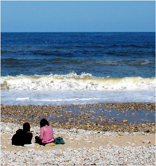
nice picture, nice colors, nice composition, not sure about the peron on left being so much darker and seems almost like a cardboard cutout or something...gl 8
My attention is drawn more to the crashing wave than the people (which I assume are the intended minimalistic focus). They need to evoke more questions about why they are there.
Sorry, but this photo appears to be too overprocessed (and too harsh a contrast) for my tastes. Something like Neat Image would help clean up the sky noise.






 Add photograph to your favorites
 Add photographer to your favorites


