First of all, let me congratulate you on your top scoring photo with this one.
This is a very nice, simple photo.
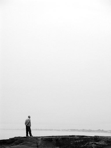
Very good use of negative space in the upper portion of the photo. You did a very nice job with that. Attention is definately drawn down to the subject.
The background has the appearance of being tilted, however, sometimes it's more of an optical illusion.
The shot does seem a bit grey, maybe a boost of contrast could help that some.
Focus and clarity appear to be right on, and I see nothing that is distracting at all. Which, I think is the point behind being simple and minimalistic.
Lighting looks to be a bit overcast, which could be the reason for the greyness. Or, the greyness could be a reason the photo looks overcast. Eitherway, I think this shot would benefit slightly from some contrast adjustments.
Nice take on the challenge.
~Heather~
My understanding of Minimalism is almost surely insufficient to judge the purest aspects of whether or not any particular image meets or misses the classic spirit of the genre. And yet this photo looks and feels just like something I'd tried and failed to accomplish. In noting my failure, I'm forced to salute your success .. thanks for showing me one way that I might have approached it had I been better prepared and clearer in my thoughts. My attempt was based on my thoughts that this idea would work -- that it would qualify -- and in the end, that this would succeed. Here's hoping your degree of success with it is all it should be.
Lovely entry. I like the candid approach here. The composition is quite interesting with the far shore off in the foggy distance. Techically with adequate sharpness, detail, and processing without artifactual distractions.
Very good shot. I like the composition, the way the character leads my view. There is still something about the contrast or the greys that is not right and I am not able to say it... 7






 Add photograph to your favorites
 Add photographer to your favorites

 Photographer found comment helpful.


