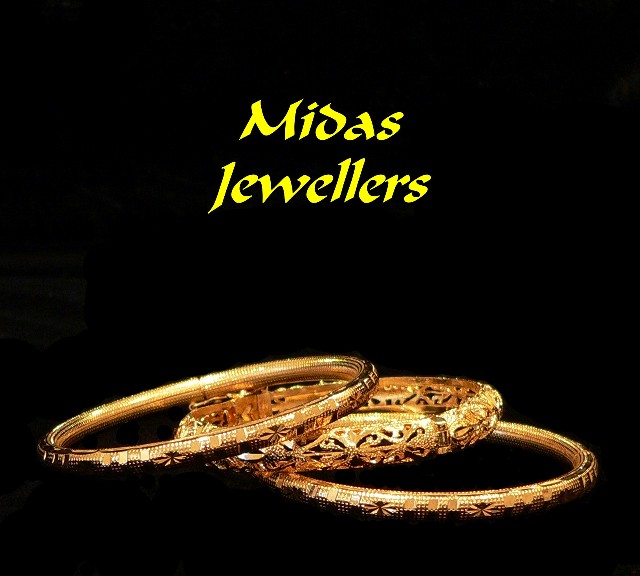
Crips, clean, great background. My only complaint is the text. For such a sophisticated photo, I think the font is wrong... too thick I think. It draws more attention than the rings and really overpowers them. Otherwise, very nice.
Nice shot of the bracelets but text a little heavy handed and garish. Peculiar grey patches to the let and around inside of left bracelet (incomplete blaking out of background?)
I like the way the rings are portrayed and their golden color, but the text, especially the yellownes is realy ugly. I'd rather have seen no text at all. The space above the rings is also to dominant.
The pieces of jewelry you selected have nice character to them. Well lit and presented in a professional manner. The text color choice I don't agree with and it looks funny (to me) centered as it is. Maybe if it had been on one line instead of two? Good luck in the challenge.
Composition is good. Touchups are awful, unfortunatly. I can see all the work done in the left ring and on the left side of the picture. Which also brings me to believe there is 'over'paint, which is against the advanced rules. Lighting is good, if only a little overdone, which splashs the items a bit too much (did you use a soft box?). Also the Font used is nice, but the colour is way too strong for the items (using the colour picker tool could've helped in selecting a colour more interesting and closer to the rings). Composition could also be a lot tighter with this shot. 4
Nice level of detail and good control of the lighting here.
Text/font used and maybe the placement is a bit off in my opinion.
Still a good submission regardless.
The photo of the rings is superb. Good lighting, color, focus, composition ... nearly perfect. But the COLOR of the text detracts. Next time I would suggest using your color picker and choosing a color for the text that is in the photo. More of a gold than a yellow. As it is the color of the text overpowers the otherwise fine photo. I don't much care for the font, but that's just personal prejudice. I might have chosen a lightr weight font more in keeping with the delicate rings. I have a favorite font that might have worked well, Papyrus. You can try these suggestions w/o reshooting. See if they don't help. PM me if you'd like after voting ends.
This is a nice pictures, very luminous gold...it's the text that takes away from the image...I think a different font may have helped, the text color seems a bit garish.
The large yellow text strongly takes away from this image in opinion...maybe something a little more subtle would have worked better, or maybe it's just the yellow.





 Add photograph to your favorites
 Add photographer to your favorites


 Photographer found comment helpful.


