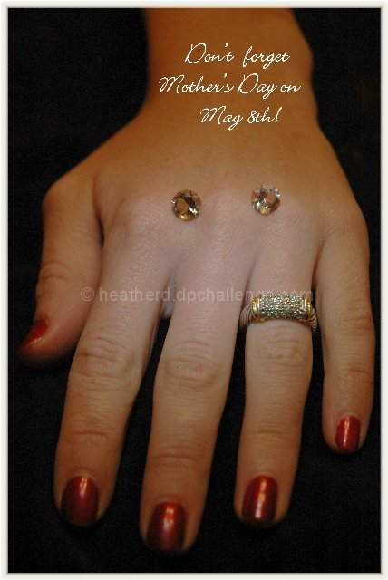
After I had submitted this photo and saw the much better submissions I wanted to take this one out, especially after receiving comments about the stones (which I cut by the way :-)) on the hand. I do realise now that it could have done better without them. It was difficult for me to get the right lighting on the hand which belongs to my niece. As I was rushing to get this photo done, I could have taken more without the stones on it. That will teach me to rush won't it? I did try taking one of the ring on it's own but I need a macro lens. Any donations accepted. :-)
I guess I can join others in the hall of shame for a lousy shot eh? :-)
First reaction to this photo is that the jewels on the back of the hand are a really silly thing. Who has jewels on the back of their hand? That one detail is strong enough to ruin the photo for me. Very out of place, very non realistic, very odd.
The lighting is uneven, which I see could be used to draw attention to a certain area, however, the area that is most brightly lit is to the left of the ring, and below the 2 random jewels.
The placement of the hand is awkward. The perspective is distorting the hand in weird ways. I think maybe having the hand horizontally placed, and not straight on the back of the hand might have created more visual appeal in my opinion.
Focus on the ring seems really good. It's a pretty ring, and I think it would stand on it's own without the jewels. The DOF does not work as a jewelry ad for me.
Overall the photo seems awkward to me.
~Heather~
looks a bit dark..the detail on the ring is very good, but the two jewels on the back of the hand may not have been a good idea. A little more background all around and the copy would have perhaps looked better in the upper left, off the hand.
This is an interesting shot, though I'm not sure I understand the placement of the two diamonds on the back of the hand? To me they seem out of place. Also, to me the text does not work well on the hand, I think it would have worked better in a black area of the photo, but these are all just my opinions, so please take them as that.
Thanks for the reminder. How many commenters will say that I wonder? ;^) As for the image, somethings not working for me - looking for some pop, sparkle, pizzaz (sp?). Everything seems kind of muted. Hard to explain...it's almost like the photo is more about the hand than the jewelry? Sorry I can't pinpoint it more for you. Good luck.
Is that a jewellery smiley? Don't like the "eyes" - v distracting. middle of hand appears to be losing some colour. Front of hands is a bit distracting - birhgt fingernails, but out of focus.
Everything in this shot seems to work OK, except the two, loose stones on her hand (for em anyway) They just seem out of place there.
If they were meant as a suggestion, perhaps it would have looked better to have them on the side or in front.





 Add photograph to your favorites
 Add photographer to your favorites


 Photographer found comment helpful.


