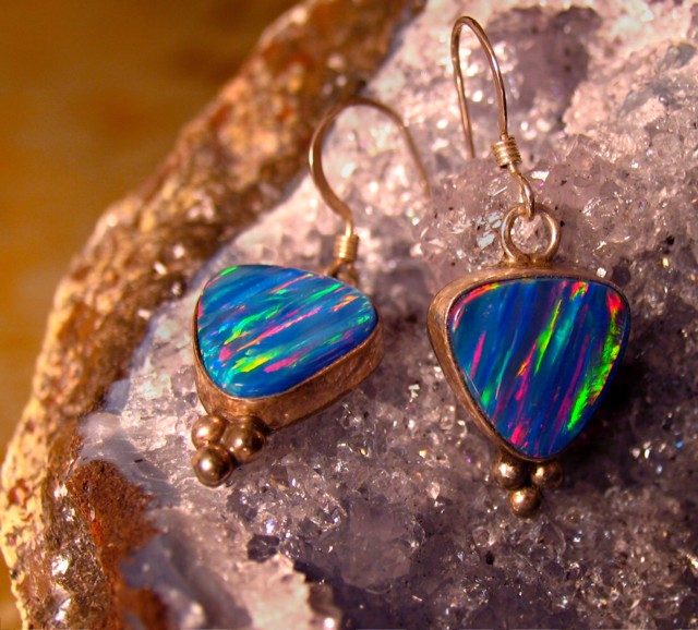
I like the background (the part under the earings) but the left side distracts from the overall picture. Would have been nice to have seen more of the sparkly background instead.
This let's you see pretty clearly why they're called fire opals -- nice color and detail. I like the use of the other rocks/crystals as background, although the untextured area in the upper-left is actually just a little distracting by its color and smoothness -- maybe if that area was used for text ...
This would be so much nicer if everything was in focus. You needed to use a greater depth of field. The colors are great, the layout is great. The lighting could be a little stonger in the bottom right hand corner.
The gold looks like dirty brass, although the opals look good. try using a white reflector to give the gold a cleaner look. Also add some text to make it look more like a magazine ad.
There seem to be tangible planes of focus here, and I would think this would work better if the entire jewelry object were within that plane. The hook of the left earring being outside the plane is frustrating, because all of the other pieces are within the plane. 6
The comp and color here are fantastic. The background is detailed but not distracting, the composition lends itself to text placement. I'd like to see a deeper DOF that would show theearring hook crisper. An outstanding idea none the less.
This is interesting. A refreshing approach to jewelry. The lighting and focus come together nicely. As for composition I would have tried to use all of the rock for background - the top left corner of this image is distracting and takes away from the photo. Maybe if the area behind the rock was solid black or white?





 Add photograph to your favorites
 Add photographer to your favorites


 Photographer found comment helpful.


