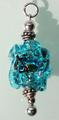
beautiful bracelet/neclace though the focus seem a bit soft, also the red line is awfully distracting, really draws away from the charms in my opinion.
There is a lot of noise on both sides of the bracelet. I find the red line a bit distracting. Its nice to see something other than a diamond or a watch though. Good luck in the challenge.
The color sat on the jewelery is nice. I think whatever that red line is distracts from the jewelery. Also a bit more light on the jewelery would have been nice. I know you were going for lowkey but the object of the photo should still be lit up when we are talking about a jewelery ad. 7
Colours are something intriguing. The display of the jewel is an interesting idea, but doesn't work very well. The line is not even (slight leaning towards the right) and the Red line takes lots away from the eye. The background is wierd as its tainted with 'green'? spots all over, and the cloth used wasn't clean with SpotEditing, which shots through the black. 5
The red line is very distracting. The background seems dusty also. Interesting piece of jewelry, wish it had been presented a little differently. There seems to be some fun color in the bracelet - with the right lighting and a little closer look this could have been a great image. Good luck.
Maybe a bit too close on the shot, thus losing some of it's sharpness in the process.
I don't know what the red stripe is, but it is a distraction in this shot (plus it's kinda' crooked too?)
I can't possibly be telling you something you haven't already heard but that orange line is just wrong and the charms should be in better focus. Cute bracelet, though.
Perhaps you should try a little harder next time. A helpful hint... actually LOOK at the photo before you submit it. The red line that is at the edge of your backdrop is terribly distracting.






 Add photograph to your favorites
 Add photographer to your favorites


 Photographer found comment helpful.


