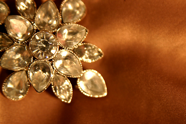
The first thing that jumps out at me right away is the focus. It seems a bit soft on the subject and there is a small piece of cloth in the bottom right corner that is in perfect focus. I think I would prefer a wider DOF to show more detail in the jewelry itself and less on the background.
The color seem odd as well. I realize the background is orange, but the jewelry has kind of an orangish tint as well. Maybe the white balance was off, maybe it was lighting, or could just be reflections of the background. Can't really tell without being there, so you may be the only one to know where the issue lies.
As far as being a Jewelry Ad, I don't think it is very effective at all. I can't tell if it's a ring, a necklace, or an earring. Needless to say, if I don't even know what it is, I probably wouldn't buy it. While I do like the negative space, I think it would be important to show the subject in it's entirety so we can at least tell what it is.
I see that the center jewel seems to be a bit more in focus than the rest of the jewel, but it just doesn't seem like enough to me. I want to see what I am buying.
~Heather~
Composition & lay out was good, but detail & focus a bit too shallow on the jewelry.
Background material areas in focus on upper & lower right sides a little distracting. (5)
I don't know if it's the actual coloring, but the ring is giving me a yellowish coloring. Also, it appears the stone in the upper left corner (the one in focus) has a finger print on it. Or I could just be seeing things.
Very very nice composition, It lends itself well to text placement. However all the stones need to have the same clarity as the center one (I.E. deeper DOF) How the DOF effects the background could be revised as I see texture is some parts.
Something doesn't seem right. The jewelry doesn't appear to be in focus and comes across looking dull instead of sparkling. The backdrop has an area clearly in focus in the bottom right corner. Sorry, wish I could be more positive.
Interesting composition. Some text could've helped here. A frame as well. Unfortunatly, the DOF doesn't give this item justice; since its entirely of the same colour, using a very wide aperture (2.8, 3.2?) didn't help to bring out the jewel. It kind of blurs the whole thing. nice try tho. 5





 Add photograph to your favorites
 Add photographer to your favorites


 Photographer found comment helpful.


