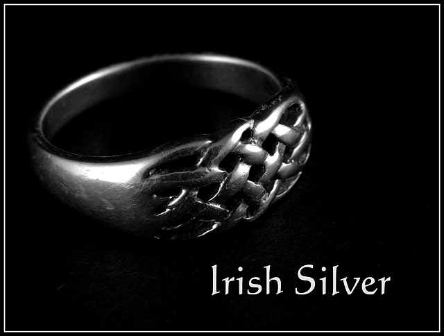
Got the ring in Dublin and my finger has not turned green yet, so it is at least sterling silver. Sorry about the condition of the ring, I wear it all the time and is has not been cleaned.
Shot in a light tent on a back background in macro mode with a 10x close up filter. Shot in color and coverted to BW. Added text and border.
Statistics
Place: 66 out of 159 Avg (all users): 5.5628 Avg (commenters): 6.3846 Avg (participants): 5.2843 Avg (non-participants): 5.7586 Views since voting: 1104 Views during voting: 384 Votes: 247 Comments: 31 Favorites: 0
First Impression: Simple uncluttered image. Detail of the ring captured quite well.
Composition: The offcentre placement of the ring works well and seems to be balanced with the text.
Exposure: If a moody effect is what was intended then the exposure is good. There are only a few small hot spots on the ring. This may have been preventable by changing the camera and/or lighting angle.
Impact: The impact of this image is very subtle. Depending on the expected audience of the advertisement this may work though a more dramatic image might be more effective.
Beautiful ring. I adore Celtic art.
Technically, I feel that your shot is too dark and the composition a bit too static. Adding another light source may have helped.
The ring is too dark. If you could have brought the light on the ring up higher but softened it with a piece of paper or something it really would have helped. The font on the words are nice. 5
Simple, to the point. I like it. Good choice of using black with the silver. Lighting is fine in my opinion, although I'll bet you will see a couple of comments that it's hot in a couple of spots. Good luck in the challenge.
text is too loud, competes with the lovely photograph in a most unappealing way. should have definitely been in a smaller font and possibly slightly grey, IMO.
Controlling lighting and blemishes when doing macro jewelry is the toughest part of this assignment. Your bright spots are too hot and the blemishes on the ring itself are distracting to a potential buyer.
good choice of a Gaelic style font to go with the Irish feel and the shot is good but I would expect in a "jewerly ad" for the jewelry not to look so worn
Nice ring! I have scotish blood, and this makes me feel right at home! Of course i,d wished for a 'shinner' ring, with less scratchs, but i understand the difficulty in finding something nice to shoot. Lighting is nice, if perharps slightly too strong on the reflections. I think i'd want to see a little more of the set on which the ring is resting. Text is simple and efficient which is very nice and quite rare in this challenge. Frame works perfect as well. Very classic and to the point. 7
You handled the reflections nicely. I think I would have cloned out some of the lint and such on the ring and cloth but I'm not taking away any points because of that. Nice dof.






 Add photograph to your favorites
 Add photographer to your favorites


 Photographer found comment helpful.


