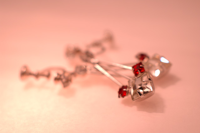
light from under and above.....
sat them on a pice of glass (with white paper under it) spanding two small boxes, the glass was lite from under by my desk lamp and above by a hanging lamp with a clear bulb in it.......
shot with a 50mm macro manual focus to just the very tip on the diamond
.....they are old yes but i though that of all my grandmothers jewelry they where some of the prettest pices.....
(note also they don't really contain diamonds they are just really good old coustume jewelry pices....
thanx for all the votes and comments
Statistics
Place: 145 out of 159 Avg (all users): 4.5344 Avg (commenters): 4.6667 Avg (participants): 4.2449 Avg (non-participants): 4.7248 Views since voting: 1048 Views during voting: 375 Votes: 247 Comments: 34 Favorites: 1 (view)
Thank you for entering the DPChallenge, Jewelry Advertisement.
Great idea and composition. The color and mood this image presents is worth looing at. Sounds like you did a lot of preparation for this challenge, and thought out the details. You have some good material to work with.
The jewelry is primarily out of focus. It is right in the middle of the frame and it distracts from the beauty of the jewelry. You needed to experiment with some better "Depth of field" options. You seemed to have the equipment, lens, camera, etc.
The entire jewelry piece is hard to see. It is blurry from back to front. Very unfortunate, since it has lots of potential for displaying well. You picked some great color combinations. Your light source also went well. Somehow between the execution and the final image, it came out blurry.
Technically looking at your camera settings. You say you shot this manually. You have a very fast shutter speed 1/400 of second. That's pretty fast for still life. Try experimenting with a much slower time and using a tripod. Also use the Nikon's auto timer, with the tripod. This should eliminate much of the blurness.
In jewelry advertisement, its very important to exact details. Its the details that sell product. People want to see all of the jewelry, as they imagine themselves wearing it.
Good effort, work on the DOF, and try different camera settings.
The gratdation of the background of the earrings distracts me very much away from the subects. The attempt to me minimize the focus of the subjects is a bit much for my tastes, I would like to see what it is I might be buying.
I like the range of colors in the shot from red to white and most everything in between, but I would like to see more of the jewelry in focus (honstly, I am not sure what these are, but I am a man so that can be explained via stereotypes).
I think this had a lot of potential.
Something (in my opinion) that may be hurting this shot for me is the limited depth of field. The focus is a bit too soft on the prongs and the jewels, then falls away very rapidly. A little more in focus would make me not have to study it so hard to see what it really is. (5)
COlor are great but I'm not sure this DOF works because I have a hard time determining if this is even a pice of jewelry or sculpture. Deeper DOF might help. Keep the product crisp.
Too shallow depth of field. I would expect to see more detail of the jewelry in a jewelry ad. Composition and lighting are well done. Still a nice picture, but not appropriate for an advertisement. 6
I have no idea what the title means... ;^) Interesting piece of jewelry - earrings, yes? Nice use of lighting, I really like the shadow the pieces cast on your background. Not too fond of the red color cast, just that's JMO. Good luck.
The overall colour is really appealing, and the position of the ear-rings is good...which makes even more of a shame that not enough is in focus to really make out the item.
this is way out of focus...ok all i see is the tip in focus, i dont think a soft focus is good for advertising jewelry..maybe i'm wrong but that is my opinion..i'm guessing that the tip of that thing is supposed to be a diamond? if i have to guess i would say soft focus is not the way to go.
I like the lighting and the soft colors which complement the gemstones. I think the DOF could have been reduced just a hair to allow better focus on the two red stones.
Sorry dude. I gave you a 10 for my error in judgment. It is truly beautiful. I didn't even enter this challenge as I just couldn't think of how to make a great photo using jewelry. Now that I see all of the great photos, I wish I had entered a watch I did on a mirror. Best of luck with this oh so pretty photo. Audrey-AJFI
The dof for me is too strong. I can only see the tip in focus and not even one whole gem. Need to see more of the actual jewelry to convince me on buying it. 6





 Add photograph to your favorites
 Add photographer to your favorites

 Photographer found comment helpful.


