Ze ring is hanging from threads
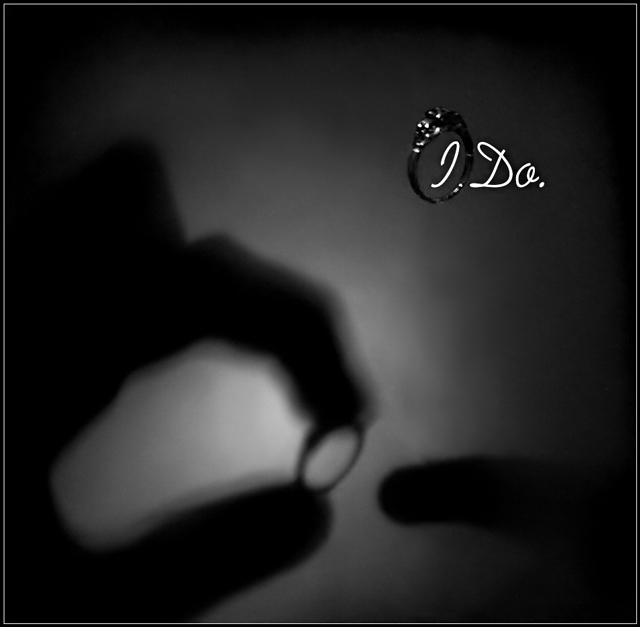
Extreme pain to pose and take pictures on timer while holding flashlight in mouth. What can I say, no one is home to help me. :o)
Statistics
Place: 93 out of 159 Avg (all users): 5.3095 Avg (commenters): 5.7838 Avg (participants): 4.9901 Avg (non-participants): 5.5232 Views since voting: 1433 Views during voting: 416 Votes: 252 Comments: 39 Favorites: 0
a) A powerful idea, and one that had lots of potential. Another attempt with perhaps better lighting beyond a flashlight held in the mouth might be very effective.
b) The shadow in particular is not precisely captured. Perhaps this is one of those two-person jobs where a model can work the hands and play with light positioning, while the photographer can focus on the image-capture process. I agree with several previous comments on the shadow, particularly that it seems as if the finger that's about to have the ring on isn't the ring finger. In terms of feminine/masculine fingers, I've got no problems with this process occurring between two men, but some people might (and that's too bad for them).
c) The ring hanging on a thread should indeed have more light and detailing work on it if you're going to try to sell it. Again, lighting work here would have made a difference.
Overall, a lot of potential in the image, and I congratulate you on the creativity level being expressed and the scope of ambition of the image. It's different from other entries, non-cliched, and fresh; and that's always a pleasure to see. Good luck in the next challenge.
I really like the concept and the shadow effect is great, but I think the ring by the text needs to be in full focus color and brigtness (i.e. use the shadow part of the ad to set the mood, use the part by the text to display the piece in full detail).
NIce effect, not sure how you did it, but its interesting. Unfortunatly i really don't like the 'low quality' shadow in the background, i feel it could've been a lot better. The I do is original but takes too much away from the already very dark ring. Not enought sharpness and detail on the ring either. 5
The background looks spooky not romantic and inviting. The one finger (an index finger?) isn't the finger you would usually put a ring on, so the image looks incongruent
Can easily imagine it in a glossy magazine! I'd like the shadow to be a bit shaper. But i can only imagine how difficult this was to setup & take! great shot
Nice use of shadows, that's creative. The ring itself in the image is a bit blurry and should be more emphasized based on the theme of the challenge. Of course, that's JMO. Good luck.
Unique and effective advertisement submission.
Would have been a lot better had the ring itself been more visible/lighter and taken the focal point here in my opinion.
I like the content on your photo! I believe the shadow could have been alittle clearer and the ring itself is too dark. Boy like I said if you were able to pull this off (how I do not know) it would have been a top 10 for sure.
This is a really great idea.
In the shadow - the out stretched finger does not look femenin. As stereotypical as it is, in an ad and with so little showing the, woman's finger needs a manecured nail. The ad also needs to show a clearer example of what you sell. Yes it is that big a deal to the women who are looking around. :)
Otherwise I really like the setup, the tones, softness, and how the letters and ring pop out. Nice font style and size. Good luck!
great idea here - silhouette tells the ring's "story" - I would like to see the actual ring more. Could be a misinterpretation but it looks like your puttng the ring on the index finger ?? I'm sure you're not but since there are no other fingers in the receiving hand, it would be akward to hold your hand that way.





 Add photograph to your favorites
 Add photographer to your favorites

 Photographer found comment helpful.


