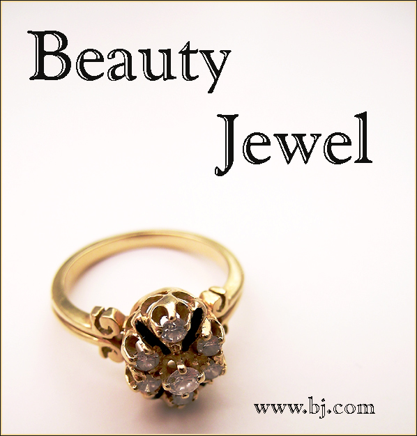
A nice composition. I would have prefered the concentration of light on the face of the ring. However, there is enough detail showing to make this a very good image. Bumping up.
This is a very sharp image and i really love the ring, but I have a problem with the text. The large letters at the top look pixeled and not rounded. It doesn't compliment the image well
BJ.com huh? I think I went to that site once and it wasn't a jewerly site.... Just messin. I like the dof on the image. I wish there had been a bit more light on the stones to bring out the colors in them. 7
Pretty decent image of the ring. The face of the ring where the jewels (and emphasis is) is a bit dark. Good DOF. The text used looks like it was upsized and looks jagged around the edges. Best of luck in the challenge.
your ring shot looks great. nice soft lighting and good use of shallow depth of field. I don't care for the font or the dark black choice for it, though.
Its the text. It would have been nice if there was some reflection in the diamonds. I do not like the layout. Wish the diamonds were facing the camera(so all the diamonds are shown) A little reflection on the diamonds may have brought out this ring. Looks like a beautiful ring.
The angle of the lighting for this shot is wrong which leaves the stones in shadow. You need to lower your light to a point that's almost below the ring in order to get the lighting effect that will focus attention where it needs to be.
Great comp. I prefer a deeper DOF and maybe a different angle on the ring. The text seems to have pixel problem. Your have to add it after you save for web.
A lot of potential regarding the quality of the lighting used and the subject material, but the ring seems a bit too low in the frame and the upper text is way too overpowering.
You seem to have a nice studio setup here. I wish the gems were lit to sparkle, they seem grimly dull. Advertising wise, your text is overwhelming your product. Perhaps a lighter color, transparent, and/or smaller. Nice DOF.
IMO, the font distracts from this image, it does not looks "classy" enough I think. Also, I would have tried to get more life and shine into the gems, they look rather dead. perhaps a slightly more "head on" angle to the gems would have helped, instead of looking down on them.
Oh no ya don't! I'm not gonna click your URL! You'll get love / hate comments for that. Pic's pretty good though - composition and color are good. Good luck.
Did you check what kind of web site www.bj.com is? I like the joke (I had my suspicions... if you'd put www.beautyjewel.com I would not bother going there checking it out).
Technically, I wish for a different perspective. This is taken from a higher point I would prefer for a ring of this type - shooting from a slightly lower position would have given you better reflections, I think. 6.





 Add photograph to your favorites
 Add photographer to your favorites


 Photographer found comment helpful.


