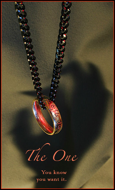
As I've gone through all the images in the contest, I keep coming back to the fact that the ring doesn't look as smooth and shiny as I would like it to. I think a lot of that has to do with the cluttered background it is reflecting. I spent so much time worrying about light sources and backdrop, that I forgot about what was behind the camera. Lessons learned.
If anyone is interested, I've got a couple photographs of the setup (with my film camera in place of the digital camera, and a glove in place of my hand for the shadow).
I realized that the 'catch' of the image probably wouldn't make sense to anyone not familiar with Tolkien's books. And that's okay with me. I really had fun coming up with the idea, and executing it. (By the way, the ring belongs to my wife--she won it in a local radio contest 3 years ago during the LOTR frenzy.) There are definitely some technical aspects that could have used some polishing.
sche2964: Thank you for your specific input. It's well taken. I had considered a brighter chain, but in the end, I wanted it to appear dark and heavy, the way a ring-bearer might perceive it...still, visually, it probably would have been more striking.
LadeeM: You're absolutely right about the focus. The 15 sec. exposure with kids running up and down the hall, and cluttered background reflections really hurt me there. It's definitely given me some food for thought in how to overcome that in the future.
Digital Quixote: That's an interesting point about the thumbnail. I vote on the images randomly as the server feeds them my way, so I hadn't considered that point. What to do? ;)
Sonda: Thanks for the comment on the background. I was sort of going for a rocky cave wall (since the ring repeatedly traveled through caverened regions), with the ring exposed for the taking. I must concede that it was usually around Bilbo's or Frodo's necks and would never have been dangled around like that. :)
Snackwells and BradP: Thanks for the suggestion about desaturating the colored catchlights on the chain. I think I didn't mind it at first, because I felt it gave some reason for drawing the red into another portion of the image besides the ring. But those catchlights are so harsh, that the color does seem distracting.
BradP and glad2badad: Oy. Yeah, I'm not happy with the red border either :-/ I know that running out of time is a crummy excuse...so uh...let's pretend I didn't just try to use that as an excuse ;) I think just leaving it black would have been a better call.
DustDevil: I would loved to have seen your concept. If you ever do that, send me a PM and a link!
srbrubaker: I agree with you about the background color. During post-processing, I tried to change the background color to something that worked better with the colors in the ring, but everything failed miserably. I needed to control that while making the shot.
Isabeau: That's the kind of nerdiness I was shooting for :) Thanks for the comment on the shade of red. I think your right, giving it more of a yellow component would give it a more fiery appearance.
auburnfan0930: Thanks. I like your observation of "I can't decide if it is clawing in passion or stealing it."
graphicfunk: Are you referring to the pinkishness of the red? I agree that it could use a warmer shade. Although I couldn't get rid of the red and still capture the allusion to the Lord of the Rings imagery. Thank you for the comment!
A very cool presentatiom with tension and great lighting but the red distracts a bit. A natural color would have given this image a real boost. Bumping up on great composition.
I love this one! You have put a lot of thought into this, good suggestive setup, yet leaving plenty to the imagination. I do hope people will take the time to think about this one for a moment.
AH! I love this pic :)
The only comment (comming from a nerd, sorry) is that the red is too redish, not orangy enough, so it doesn't look enough like fire to me.
I must be missing something. The scary looking hand shadow, the red color cast...? Interesting photo. The lighting, composition, and details are very good. I think the red border distracts, but then you're probably trying to tie it in with the overall red tone. Good luck, this should make top 20.
I really like the allusion to the Lord of the Rings. I like the shiny glowing quality of the ring and the shadow of the grabbing hand. I know it is ridiculously silly to feel as strongly as I do about the colors, but the muted taupe clashes mightily with the warm pink and coral, IMO.
Glad to see your the only one with this idea. I was thinking of something simular, but was going to try and heatl some metal and then stick one of my "the one" rings as a scarifice. Great shot. Gave it a 7.
I love it but the supply would be limited, no? Great comp and lighting and shadows! Very creatve! I like how you placed the text to contrast. You'd do well in advertising.
The red in the border is a bit of overkill in my opinion.
Perhaps had this been edited with another layer, desaturate the reds, and then brush them back in on the ring only may have worked better (remving the red from the chain only).
Love the humor in this entry. I would like to suggest the following: selectively highlight the chain and desaturate the blues and reds to eliminate the colored highlights off those links.
Love this idea. Beautiful text, and great composition as well.
The main thing that I don't think work with the rest here is the textured background... looks like a textured wall. Not sure what would have worked better... Maybe it actually hanging around the neck of Elijah :p j/k.. 7
This is one of the cleaverest photos in the challenge. It is well executed ... photo, text, font. Love the way the shadow works! My only fear is that the thumbnail looks so dark, it may not attract voters to open it and give it the score it deserves.
Yes I do! Nice advertisement on a fictional classic! The color of the chain I am not the fondest about. Maybe a shiny bright one as shown in the movies would've worked better. Good work!







 Add photograph to your favorites
 Add photographer to your favorites


 Photographer found comment helpful.


