Heather, thank you so much for your insights. I agree with your comment on the DOF as many viewers do not understand it.
Originally posted by hbunch7187:
*Critique Club*
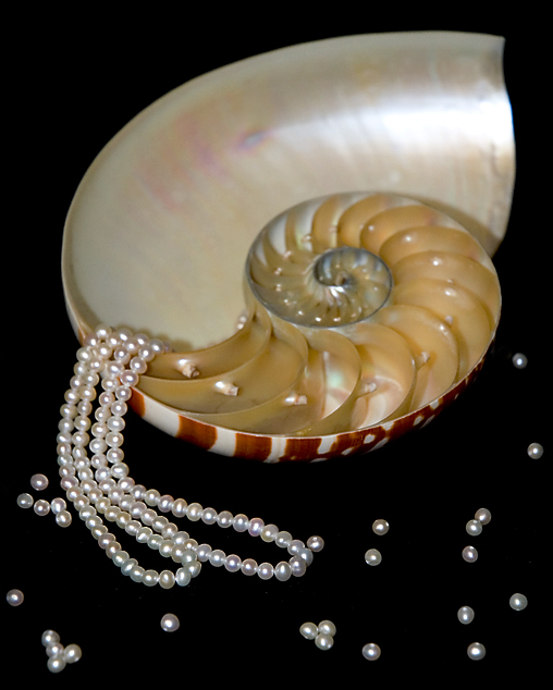
Definately a good idea, but I'm not so sure it turned out the best it could. In my opinion, a few things could have been different and it might have made the visual impact of the photo a bit higher.
Before I started anything with photography, my first time on DPC, I would see some photos and say to myself '1/2 the pics out of focus'. Then, as I learned the benefits of DOF, it made sense and I began to see photos differently. What I'm trying to say is that I'm not sure if the 'non-photographer' would understand your DOF in this 'ad'. A non photographer might look at this and say '1/2 the pics of out focus'.
I'm not really sure that you benefit anything from having a shallow DOF here. All it does is blurr the back of the shell and the pearls in the front of the photo. I'd like to see it all in focus.
Another thing I notice is that there are little 'pearls' in each chamber of the shell. They don't look like pearls, but they are similar color and size. I find that a bit distracting from the necklace itself.
Lighting appears to be just good, except for a small spot on the upper portion of the shell that is a tad too bright. See how it almost looks whiter than the necklace?
I like the placement of the shell and necklace within the frame of the photo. Having the necklace kind of pour out of the shell is a neat idea. As for being an ad though, there really isn't much space to put your words. That's just a minor thing, but something to think of if you were going for the ad theme.
Overall, a neat idea that just needs some 'cleaning up'.
~Heather~
Definately a good idea, but I'm not so sure it turned out the best it could. In my opinion, a few things could have been different and it might have made the visual impact of the photo a bit higher.
Before I started anything with photography, my first time on DPC, I would see some photos and say to myself '1/2 the pics out of focus'. Then, as I learned the benefits of DOF, it made sense and I began to see photos differently. What I'm trying to say is that I'm not sure if the 'non-photographer' would understand your DOF in this 'ad'. A non photographer might look at this and say '1/2 the pics of out focus'.
I'm not really sure that you benefit anything from having a shallow DOF here. All it does is blurr the back of the shell and the pearls in the front of the photo. I'd like to see it all in focus.
Another thing I notice is that there are little 'pearls' in each chamber of the shell. They don't look like pearls, but they are similar color and size. I find that a bit distracting from the necklace itself.
Lighting appears to be just good, except for a small spot on the upper portion of the shell that is a tad too bright. See how it almost looks whiter than the necklace?
I like the placement of the shell and necklace within the frame of the photo. Having the necklace kind of pour out of the shell is a neat idea. As for being an ad though, there really isn't much space to put your words. That's just a minor thing, but something to think of if you were going for the ad theme.
Overall, a neat idea that just needs some 'cleaning up'.
~Heather~
I really love this one. The pearls look really luminescent (I thinks that's how they are supposed to look! lol) but having all the loose pearls scattered on the black makes me just want to pick up the necklace and put it on. Love it!
The lighting on the pearls is very nice. Overall, the relatively shallow DOF is working against you. IMO it should either be sharp throughout or even more OOF at the back.
Composition is inspired, beautiful, clever. The result is quite dramatic. I wonder whether the strong white reflection in the shell unnecessarily draws our eyes from the subject; and whether it could be cropped out without ruining the spacial strengths of the photo.
Unique composition.
Lighting here is good, but kinda' have a little issue with all the loose pearls. Maybe less of them or just not scattered all over perhaps?
nice idea. I think a lower point of view would have had more impact. also with the total black background the stray pearls look like they are just floating in space rather than being grounded on the display surface.





 Add photograph to your favorites
 Add photographer to your favorites


 Photographer found comment helpful.


