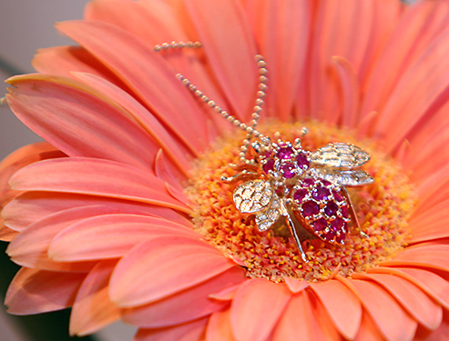
Colorful and cheery layout.
The jewelery is getting a little lost in the middle of the flower in my opinion. At 493x375pixels, a tighter crop could have been achieved or better details presented.
We are allowed 640 pixels on the longest side, and up to 150K. Using as much of the 150K as possible will only help to not compress the image. If you need help in understanding or making these happen, please don't hesitate to PM me and I can give you some pointers. (5)
I generally like the photo, but I think it would be more effective with tweaking the background. The flash of green at the bottom left is a distraction, as well as the splash of green above that. The flower color perhaps isn't the best considering the purple hue of the jewelry. Perhaps a color that would present more contrast factor to the jewelry should be used. I do like the DOF and the idea here, so will do a 6.
Nice colours! Wish they could've been a little more bright. The pic shouts for Contrast IMO, and the jewel is unfortunatly, not well focused. Perharps due to lighting? NIce non the less. 6
I love the use of the flower here, but the bug jewelry in the middle is a bit out of focus. The focal plain appears to be right in font of it instead of on it.
It's a neat concept but the piece seems as little lost in the flower. A different flower...perhaps darker or richer in color may have been a better choice







 Add photograph to your favorites
 Add photographer to your favorites


 Photographer found comment helpful.


