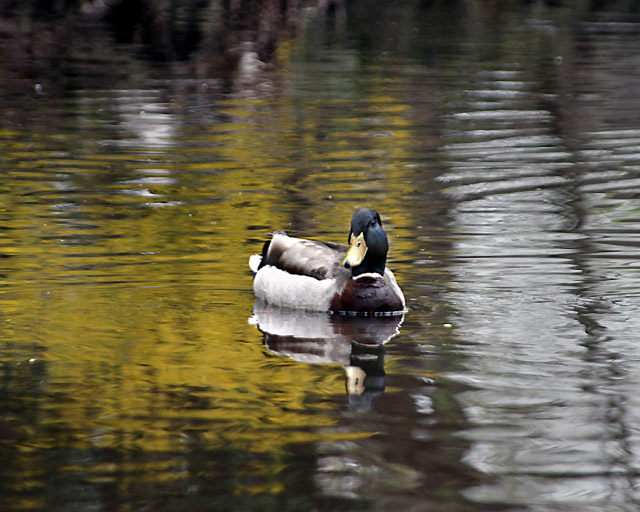
To me, I think this would be more interesting if the duck was not in the center of the picture. Also, there are competing reflections of color here, white and yellow. You could make this black & white since the darkest and lightest tones in the picture are in the duck itself, and i think that would eliminate the distraction of the color. Nice effort though. 6 (if this didn't make sense, let me know, and i'll try to explain it better.)
Bullseye! Except thats not a good thing. Try placing the duck in any of the 4 intersecting thirds for a more impact on the photo. Perhaps also some action from the duck would make it more interesting.
For me the expression on the duck lends itself to a non-centred composition. The white reflection on the water on the right is also a distraction - perhaps it could have been cropped. Would have been even better without so many ripples in the water. Otherwise a solid attempt for this challange.
I hate Duck Pictures. I do however like the colors in this image. The yellow in the background reflection really surrounds and seperates the duck from the rest of the image quite nicely. A good clear image, with good detail, and clearly within the guidelines of the challenge, which seems to be lacking in many of the images in this challenge. <6>





 Add photograph to your favorites
 Add photographer to your favorites


 Photographer found comment helpful.


