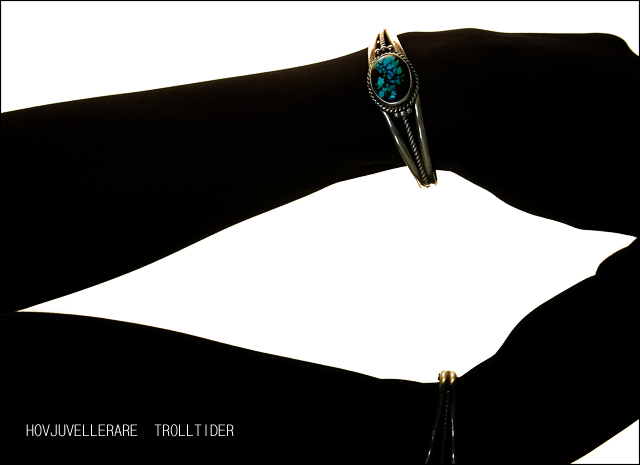
1. The "lower" arm is a mirror image, I had the arm resting on top of a mirror.
2. The text does not suffer from compression :p it is a font called GulimChe which is an uneven font.. And I guess some doesn't like it.. I just happen to love that font :)
3. Yes.. I used a black stocking.. my initial idea was to make the arm completely black like a silhuette, but I liked the texture so much so I decided to let it be seen :)
4. My screen might be messed up, but if I would have pushed the lights and colors on the bracelet it would have been oversaturated and blown out..
Statistics
Place: 27 out of 159 Avg (all users): 6.2314 Avg (commenters): 6.9697 Avg (participants): 6.0100 Avg (non-participants): 6.3873 Views since voting: 1915 Views during voting: 407 Votes: 242 Comments: 43 Favorites: 3 (view)
Wonderful image... Very creative... I't really has an ad feel to it... Very apelative.
Simple but effective... Great shot you got here... like all the photos on your portfolio... You are very creative keep it up... i am enjoying seeing your work.
Hey Eva, I gave this an 8. It was definitely one of my favorites from the challenge. I like your treatment of the type, too, and good typography was rare in this challenge. (I like GulimChe as well--its unevenness is really appealing.) I actually don't see the texture of the stocking at all. I guess my monitor is darker than yours. But that does answer the question of how you got the great silhouette-like effect, which I thought was amazing. Very well done.
This so reminds of the debeers comercials way back in the day. I like how it looks though. I wouldnt have thought a stocking. I was first thinking your used a light box on the bottom and shot it from the top giving a natural silouette. Well done nice shot.
Perhaps one of the more unique shots in this challenge.
The high-contrast Black & White works well in an advertisement composition, though the lower bracelet is a bit lost. Effective text/font used. (6)
Cool idea. I like the way this is presented, unfortunatly, the bottom part is cut and is bugging me quite a bit. Also the text suffered from compression as its uneven. Nice little frame too. 7
the white triangle in the lower right takes away from the image imo... Plus im not too sure what im looking at, i see the upper form as a arm but have no clue what the lower form is, especially with the triangle in the lower right. I think also rotating the image 90 clockwise would have been a better orientation.
Wonderful idea with a good technique. It looks so good I'm almost hesitant to mention there could have been a wee bit more light on the stone itself. Something about the composition doesn't attract me. I will look back after the challenge to see if the model is wearing dark hose. If so, it was a brilliant idea. I'm going to have to remember this.
One of the best compositions in the contest, but the jewelery doesn't catch my eye quickly enough. Maybe more contrast or exposure?I'd recommend a Different font too. (Thicker.)
I like this idea a lot..the top bracelet is lovely with the silhouette, but the bottom one just seems to disappear..is it a reflection? I'm not certain if it's the same or another bracelet on two hands...maybe i'm just confused tonight.
Interesting idea. Nice use of silhouette and mirror effect. I find the composition to be a bit odd and the jewel uninspiring. Font is annoying to me, sorry. Good job overall. Good luck!





 Add photograph to your favorites
 Add photographer to your favorites

 Photographer found comment helpful.


