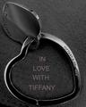
Only two problems I have with this photo are that the lower words are out of focus while the upper words are very crisp, along with the glare on the top of the ring. Nice shot though. I love the light blue background.
Great shot! Slight ccw tilt about 1-2 degrees .. The chromatic abberation on the right is a little distracting - often caused by adding a magnifier filter to the camera. Obviously there was a very shallow DOF as I would have liked to have seen the Japan Mov ..... words clear as well.. But I am going to bump you up - good job 8
The center of the watch is good. The body is not complete. On the rt side it almost disappears. The glare on the rt side makes the crown blend into the background. Perhaps a little different background.
Perhaps a bit too close for an advertisement in my opinion.
The cyan reflections and the cyan "blotches" in the background might have been removeable by taking the Hue/Saturation adjustment in your editor, sliding the lightness of the Cyan channel all the way bright, or taking it's saturation all the way down.
This is "OK". I think the DOF could be a bit deeper to include the winding button/dial on the right. The shadow in the date window on the watch face is a bit distracting. Otherwise, nice shot. Good luck.
very nice close up...doesn't feel "in your face" even tho it is close....simple designs...you get a beautiful view of the detail...the curves...the lines...simply wonderful!!!! Great job!!!






 Add photograph to your favorites
 Add photographer to your favorites


 Photographer found comment helpful.


