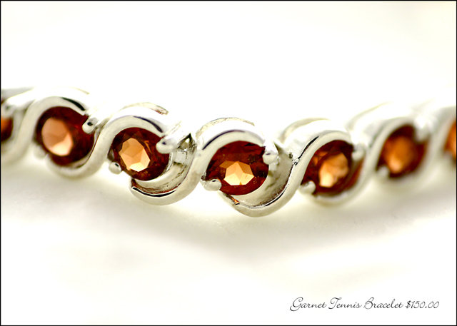
I think this is a good image. There some blowouts and I think you could have gone with a deeper DOF as only two of the five links are clear. Probably not a good enough view for an Ad. Otherwise nice composition and text.
For me, this seems just a little too high-key for an ad, especially since it's for the specific product and not a store or artist. I'd want to be able to see more definition on the rear part of the two center-left segments, so I'd really have a good idea what that thing looks like before I went to the store. I do like garnets though : )
I wish the dof had been a bit deeper to encompass the whole bracelet in this case, with rings I would say shallow so you just get the face but with this bracelet I want to see the whole thing in focus. I like the color saturation on the bracelet. 8
A bit too much reflection on the bracelet and should have use a deeper DOF to show more details of the jewelry. I like the composition. Nice non intrusive text, I like that. 7
Lovely stone colours, but to me the lighting seems a little harsh, the dof slightly too shallow to be able to truely appreciate the beauty of the bracelet
I almost passed this as I didn't see any text, which leads to my only revise I would suggest (enlarge the text!). This is a great shot and well composed. The marketing in me loves that there's a price listed! This Dof works if the photo were crisper or had more contrast. However, I prefer a deeper one. (DOF)
Unique look and feel to this entry. I like it. It has a high-key feel to it I take intentionally - if not, then whoa you are overexposed! ;^) Nice job.
Composition: Very nice
Lighting: Too harsh
Color: Color is off. Garnets unless noted are a deep red not an orangy red color
Clarity: fair, The silver is blending into the background, this is an advertisemetn for this and should be showing off the pattern of the metal along with the stone. The two stones that are in focus show off their faciting very well
Lettering: a bit small, but extremely tasteful and in harmony with the bracelet





 Add photograph to your favorites
 Add photographer to your favorites


 Photographer found comment helpful.


