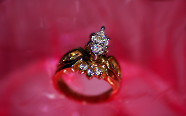
Wow. That is a lot of pink/red. I do find it a bit distracting, especiall since there is a curved seperation between the 2 different colors of background. It looks almost like a light source, but non the less, it is curved right through the ring and while we look at the ring, our eyes want to follow that curve. for me anyway.
The focus seems ok, but the DOF is too shallow in my opinion. I'd like to see the entire ring in focus, would help me to want to buy the ring. As is, I can only see the diamond, and while that is really pretty, I don't know if I'd buy it if it were on an ugly gold band. I can't see the band to know if I'd like it or not.
The angle you chose for the ring is nice. I like the tilt and the lower placement is nice as well.
I think the part that really is bothering me about the photo is that the gold band has absorbed the background color and is redish. What I want to see is somehow getting the whole ring in focus without the red reflecting in the band. Otherwise, the setup is neat and I think it would be an effective ad.
~Heather~
Beatiful ring. I wish the gold in it had been brighter. this is difficult though because then you get the bright spots on it. The lighting you used really showed up the wonderful prism effect of the diamond. 7
Nice composition overall, but seems to be a bit too blurry in the area needing the most clarity - the stones. Perhaps a bit too much Gaussian blur applied?
Hmmm...sure is a lot of red in there. For me it's not appealing (the color that is), but that's JMO. The ring itself came out very nice. Good full color in the stones with nice lighting. Perhaps just a bit too shallow on the DOF - the leading edge of the ring under the front three stones should be in focus. Again, JMO. ;^) Good luck in the challenge.






 Add photograph to your favorites
 Add photographer to your favorites

 Photographer found comment helpful.


