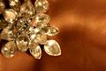
This image as many good elements, composition, lighting and choice of subject. The biggest drawback to this image is the background. It seems to be, harsh and blends with the subject too much. I think is the background was softer and maybe lighter. The subject gets lost in the background. Also as with most of the jewelry images I have seen from this challenge this to seems a tad soft. Jewelry is a hard subject to photograph, shooting a small subject requires a greater DOF than normal, the closer you get to your subject the shallower you DOF becomes. For that reason it is best to use the smallest aperture possible.
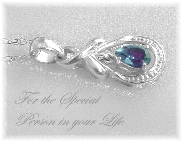
This image shows creativity and an eye for design. I like the fade on the border and the fact the chain bleeds out of the image.
Well done and keep up the good work, I hope to see more of your work in the future.
pendant is blown out and you cant distinguish between the background and the silver of the pendant. Nice layout and lettering, but this doesn't make me want to buy the item.
Great idea and layout. Maybe a little oversharpened, and the text maybe could be a slightly darker gray just to stand out but not to overshadow the jewelry. 8
Interesting idea for composition, but it makes me want to tilt my head. The soft focus (or filter...I'm honestly not sure which it is) doesn't quite work.
Lighting looks promising but the image quality is, well frankly awful. There is no detail in the necklace at all, is this due to noise due to high ISO or what is wrong here? Anyway, would probably have liked it a lot if the image quality had been good but sorry, not the case here.
The piece of jewelry looks to have a lot of image compression / artifacts that are hurting the quality of the photographic portion of this submisssion. Text/font use was good.
too much something done to the jewelry and above it....not quite sure what it is tho as im not too familar with post-processing....hope this helps u...good luck
Love the b/g and composition of this shot. Would have liked to have seen better definition on the jewellery, sort of fades into the b/g. The gem in the middle the colour is fairly flat....looks noisy. Good effort.





 Add photograph to your favorites
 Add photographer to your favorites


