You got a lot of really good comments on this.
First things I notice are lighting and skin color.
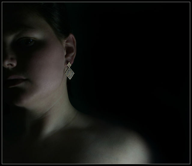
I think that while nicely done, the earring is still a little too dark. It's more of a grey, and I want to see it more of a shiny white. The person (you) seems either too dark or too bright. I will try to elaborate on that. I have seen some ads where the person is a silhouette and the jewelry is normal. This photo reminds me of those ads, except the person is too visible. If that was not the effect you were going for, then I think we need to see more of the person. Right now, we can't see enough of the person to get details, but we can see enough for it to be distracting to the earring. Hope that makes sense.
Next is the skin colors. Body has a green tone, while the face is red. Looks like effects due to the low light, but definately gives the skin an odd appearance. I played with this a bit and if you convert it to black and white and up the brightness and contrast, it eliminates some detail from the person and takes away the odd skin appearance and puts a little more focus on the jewelry.
The pose looks uncomfortable. Forced. Almost like you had planned on making the photo with the person mostly out of the photo, and then decided to keep it in for whatever reason. The black and white I mentioned with the upped contrast eliminates enough detail in the person that it helps ease the awkward pose yet still leaves enough detail that you can tell it's a woman wearing an earring.
This is just my own personal preference, things in MY mind that would have made this more appealing to ME.
~Heather~
coming back to comment. This is beautifully done, a professional job of highlighting the subject earings to make them absolutly dazzeling! one of my top picks and a 10 from me.
This is quite striking in a subdued, minimalist way. I wish you'd given us some subdued, minimalist text to show us how you visualize using that negative space..
I like the intent here and applaud you on pulling off a rather unusual & difficult lighting job on just the earring.The skin tone has a less than natural / appealing greenish tone to it that seems to be clashing with the pink cheeks. (5)
In my opinion, there isn't that catch the eye. Overall ligthing is a bit dark and there isn't much that makes the earring stand out. Composition is good.
i really do like this ad concept....it may have worked a bit better for me if the model was gazing off to the side or wasnt staring so hard...this may sound insane but i felt like i would get introuble if i took her earring
I like the layout and idea, but the shot feels too dark, and perhaps would benefit from a lighter tone. Since it's an ad, I'd probably also clean out the stretch lines around the neck. 6
alot of potential here. Great comp that would lend itself well to text. However, It needs a larger piece or more emphasis on it as I'm really not sure what you're trying to sell. Great photo and lighting.
Nice idea...let the earring stand out against the darker areas of the image. I would like to see a bit more of the jewelry. Perhaps crop most of the face and some of the shoulder out... Just a thought. Good luck in the challenge.
Excellent lighting. You almost may use the same trick in the minimalism challenge!
For this one, I would think that having less of the face and torso would be more effective. 7.






 Add photograph to your favorites
 Add photographer to your favorites

 Photographer found comment helpful.


