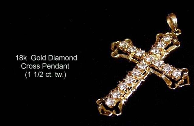
18k Gold Cross placed on velvet cloth. used mini tripod. Macro settings. Sharpened, resized, added text. Was a last minute submission wasn't even going to participate in this challenge but gave it a shot anyway .. I was uncertain about adding text didn't want to get D. Q. still not to sure about my text if its proper or not. Thought without text look really nice and classy but in another way seemed to plan and had a large amount of space. So I'm crossing my fingers on this one and I hope I make top 20 or even 30 LOL ...
Statistics
Place: 58 out of 159 Avg (all users): 5.6475 Avg (commenters): 6.5600 Avg (participants): 5.3608 Avg (non-participants): 5.8367 Views since voting: 1599 Views during voting: 390 Votes: 244 Comments: 33 Favorites: 0
The idea for this image is good; the use of negative space is excellent. Your text however is very plane, and brings the overall image down. I think not adding the text would have been the better way to go. The image looks a little soft, this may be due to using AUTO for the aperture, you may not have gotten a small enough F stop and that would have given you little depth of field. In close up photography it is very important to have more depth of field, that means a small aperture, like 22 or 16. Not knowing much about the Samsung Digimax 530, this may not be an option. If not it would be better not to get close, but crop tighter from a larger image.
The overall image is strong and shows a good eye for composition and design. If the only limitation is the camera, then you did quite a good job. Toniann keep up the good work, and I hope to see more of your work in the future.
Certainly looks like something I would expect to see in an advertisement.
Good control of the lighting & simplistic, yet effective layout. Well done! (7)
Nice layout. Great comp, ad I'm sure what your selling. Text placement needs work. Larger and different font would do wonders. so would a crisper shot of the cross.
so clear, very sharp too...I dont know if it's my temporary computer here thats without a video card, but your tips on the cross are not as clear as the middle of it. Try setting the focus on Multi, you might of had it set on spot or center. still very clear macro
Interesting composition, although i'd wished for a slightly tighter crop. Also a frame would help this shot a little bit, since there is no DOF at all; the item is floating. The text is explicatory, but is not as 'punchy' as the item itself, so doesn't attract too much attention, which is good. The cross could use some more sharpening tho, as it feels a little soft. 7
Nice theme and well done with the jewelry for the most part. The text in this one is going to hurt you some in the voting because the font is too plain and looks grey instead of white (resized the text by dragging text box?).
Nice image, though maybe front of cross just out of focal range. Lettering a little divorced from picture - informative, not augmentative. Detail missing in jewels (though hard to keep, I know)
Seems cropped too much on the right.
Placing the text a bit higher, moving the cross to the left about 1/4 of the distance would balance this composition, in my opinion.





 Add photograph to your favorites
 Add photographer to your favorites

 Photographer found comment helpful.


