Cropped, dodging and burning, aggressive colour balancing carried out in 2 layers, sharpening, gaussian blur.
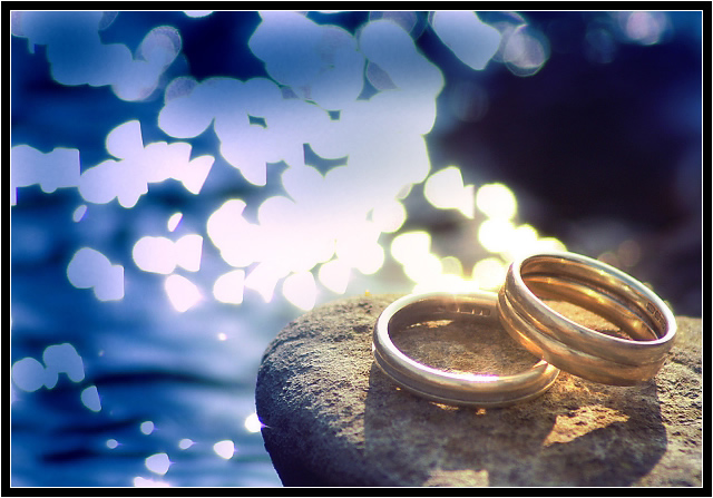
The wedding rings belong to my wife and I.
Statistics
Place: 80 out of 159 Avg (all users): 5.4535 Avg (commenters): 6.0645 Avg (participants): 5.1905 Avg (non-participants): 5.6340 Views since voting: 1740 Views during voting: 419 Votes: 258 Comments: 34 Favorites: 0
The first thing I notice about this photo is the background. It's very bright compared to the rest of the photo. The bright shapes really stand out in the shot a lot. The background actually kind of begins to bleed into the ring a bit. See on the bottom ring on the far side of the ring, how it blends into the background? It also does this a bit on the top ring as well.
DOF seems to be very narrow. Maybe a little too narrow. The rings don't appear to be in focus. I think the combination of harsh lighting on the rings and the shallow DOF makes the rings look out of focus. Having a very small part of the rock be in such good focus, and the fact that that stands out so well, increases the appearance that the rings are out of focus.
I really like the shot. It's nicely set up and simple, yet effective. The general scene is visually appealing. The way you have the rings in the bottom right works.
Overall a nice shot that, in my opinion, would benefit from different lighting conditions and a little more DOF.
~Heather~
I really like the layout, color, and amazing background. The rings seem to suffer a bit from either glare or soft focus--in all likelihood that's intentional, it's just that my eye wants to see just a bit more crispness in some part of them. Still a beautiful photo. (7)
The picture has great composition and ballance. I like the presence of the background bokey but I find it a liitle bright and my eyes a distracted from the rings..
I like this shot. The rocks are nice and clearly in focus, however for some reason the rings don't appear to be in focus even though they are inside the DOF. I'm not sure, I'm guessing it's just an optical illusion on my part.
This effect would have achieved a better result if the lighting on the subject were noy anemic. However, you get points for good composition. Bumping up.
there's something not quite right about the lighting... I'm not sure what... also I would have turned the rings so you couldn't see the inscriptions on the inside (or edited them out)... I llke the bg
Composition has a lot of potential here, but the background simply is far too bright & busy and washes out the image overall in my opinion.
Still a decent shot regardless.
Don't lose them! Nice image. Subject matter is a little plain, compared to the scenery - those refelctions in background distract attention from the rings, for me.







 Add photograph to your favorites
 Add photographer to your favorites

 Photographer found comment helpful.


