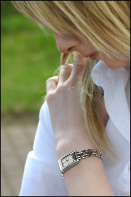
well I Did some sharpening, dodgeing and selective color to get rid of some blueness on the watch. Then I sharpened it using sharpening tool and blurred the rest a bit with adjustment layer and mask and gaussien blur on everything but the clock :) I also cropped a bit
Statistics
Place: 114 out of 159 Avg (all users): 5.1579 Avg (commenters): 5.7083 Avg (participants): 4.9091 Avg (non-participants): 5.3243 Views since voting: 988 Views during voting: 397 Votes: 247 Comments: 25 Favorites: 0
I think your pose and subject here are right on target for a jewelry advertisement photograph. Your post processing seems to work OK but the 'environment' may not be the best choice overall. I believe your model's arm and the watch would stand out more if she was wearing a darker colored shirt. The blue cast you were describing probably is a result of sunlight (or diffused sunlight) on her shirt. The background in this photo is also an element that may require some attention. I believe the green grass would make a good background itself, but the contrast between the brick and the grass may be considered distracting in some cases...
I like the overall feel of your shot, but I do have to comment on the placement of your model's hand...at first glance I thought she was picking her nose. Granted, it could just be me...it probably is just me.
An interesting image as it seems to fit the model/product advertising format. The model, the hair and the pose is great but there is a little more that should have been done with the watch so as to catch the eye. Bumping up.
I disagree with some who say that a watch is not jewellery, however I think this misses the mark a bit for advertising as it doesn't show the watch in sufficient detail to make a lifestyle statement
Strong image to tap into the subconscious of the utilitarian majority. Great choice of model - someone naturally attractive but not self-consciously so or over-primped. Lighting is beautiful and so is DOF. I even like that we do not see the eyes.
I think the strong qualities of this photo are very subtle and understated. Hope it does well.
DOF is quite nice, could've used a little more lighting and i'm not sure about the composition too much. Model didn't seem to enjoy herself too much either. 5
I'm having conflicts here as to what the main focal point is. My eyes keep being drawn to her face and hand, away from the main subject the challenge was about.
Still a good shot regardless.
Nice idea, not sure how it's going to go with the majority of voters. The focus object is small in relation to the photo. As a jewelry advertisment challenge...hmmm, well good luck. This might work for the 'Minimalism' challenge. ;^) As a photo I think you did a great job with the lighting, considering you have some backlight with a white shirt - that can be challenging. DOF fades just past the watch, keeping her face and the watch in focus with the hand blurring out - I like that. Good job overall.
nice job, I think I would have turned the watch and her hand so that we didn't see so much of the back of her hand, it's just a lot of skin surface to draw your eye away from the watch.





 Add photograph to your favorites
 Add photographer to your favorites

 Photographer found comment helpful.


