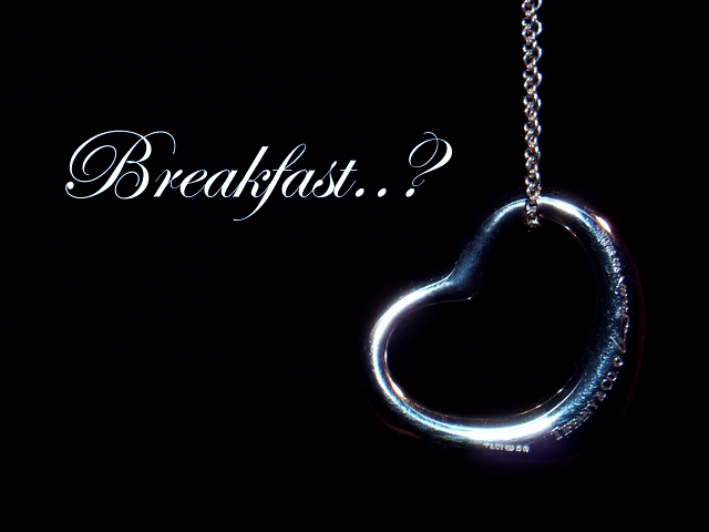
A good idea, but, for this to work well, the text on the pendant needs to be a lot bigger and more evident. Less specular lighting would help a lot too.
I like your slogan...quite clever, but I think the jewelry could have been a bit brighter, or maybe have a different exposure. In my eyes, it's hard to get a good impression of what the jewelry is.
Its not what you say I like the image and the way itwas done,my only niggle is he highlights on the hesrt,. These could have been avoided by matting it down by dipping it in milk,letting it dry and then do the photography. 7
Good composition and concept. I wonder if there was a way to better highlight the Tiffany stamp as I went looking for it because I understood the reference. It's sad to say that because of the decline in cultural literacy, many folks might not "get" the Breakfast part.
Very,very clever. However, You'll need a much crisper shot with enough contrast to really show the tiffany name to pull this off. very creative. Fonts need to be little looser (most don't know how to do this) but overall excellent job!
I like this concept and the composition overall. The lighting unfortunately is quite lacking given the harsh, contrasty glare off the jewelry piece which is quite unflattering. I recommend diffusing the flash to soften it up and you could also forego the flash altogether and use available lighting (assuming you fired a flash). Good luck.
I'm not sure i understand the slogan of this shot. Composition is however very intriguing; goes well with the text and item. I'd wish for a better focus on the item, i believe better lighting could've helped in that department. Perharps a colored lighting effect could've helped slightly as well (blue?). Keep at it! 5





 Add photograph to your favorites
 Add photographer to your favorites


 Photographer found comment helpful.


