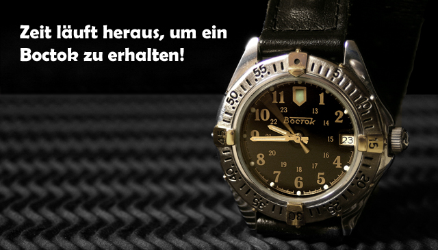
A German ad for a Russian watch.
"Time is running out to buy a Boctok!" translated from English to German. Although if you translate it back, it's "Time runs out in order to receive a Boctok!" - strange how that works!
Cropped, desat'd some yellow, sharpened, adj curves, add text.
Intention with the German language usage was that since most people won't have a clue what it says, they won't get hung up on rating the ad message and they'll focus on the photo. Also hoping to score some extra points with the Eurocentric / Euro-Elitist crowd. ;-)
Statistics
Place: 33 out of 159 Avg (all users): 6.1000 Avg (commenters): 6.9412 Avg (participants): 5.9314 Avg (non-participants): 6.2162 Views since voting: 2023 Views during voting: 414 Votes: 250 Comments: 36 Favorites: 0
Möglicherweise eine schnellere Blendenverschlußgeschwindigkeit, zum der dritten Hand von verwischt werden zu halten. Ich mag Inszenierung und Aufbau Ihrer Fotographie.
If this didn't make sense, I'm sorry. I tried to translate using dictionary.com.
Nice surface you used. Lighting and reflection are well controlled. Good composition. Watch position is a bit static. Motion of the second hand is interesting, but I don't know if it would be better is it were still. Bumping up 7.
Compostion is good, as is the lighting. I like the font os the text... even if i havent a clue what it says! unless the text relates to the second-hand moving, I would have preferred it to be stationary. Good add
Nice ad. Simple, yet strong. The image is nice and sharp and the light on the watch is just right. The zig-zag mat underneath helps the image and doesn't take away from it. I'd go look. It's missing something small. Maybe a thin line around it or something else. 9
OK, I can't read this, but makes no difference regarding your submission.
Good lighting and well composed shot with a complimentary background. Text/font used works well here too.
Nice choice of background for this image. Everything in this image works well (except that I can't read German). Only negative I have is the hotspot on the top left of the watch near the watchband. Great work.
I like your setup. The way you have presented this watch is very good. Light seems a wee bit harsh to me, but it's fine. There's something behind the watch that grabs my attention. I don't know what it is but I think it would be great if you could avoid it. Just an opinion.
Composition: Excelletn
Lighting: Very nice!
Color: excellent
Clarity: excellent
Lettering: would like to see the Boctok lettering used if possible, but this is good
Gosh, hope you can understand my post. Fine watch with a good supporting setting. I like the hand sweep. Nitpic, the fade off in the background seems, to me, to be to abrupt. That's the transition between gray and black.
interesting composition, would do good on a billboard. The picture could've used a slighty better focus, the sharpness is lacking a little. I find the 'black' background to be distracting as it doesn't split the image in a good way with the watch, taking away the bracelet. Also, there is this big reflection in the lens (goldish white) which doesn't help. Dig what the watch is resting on tho. 6








 Add photograph to your favorites
 Add photographer to your favorites

 Photographer found comment helpful.


