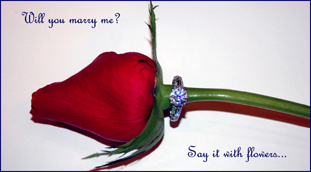
Thought behind this was good. A rose & engagement ring - classics together.
Overalll the lighting is a bit harsh and the shadow(s) are too strong / distracting.
Effective text/font used. (6)
Nothing like a rose but when you do employ one you must give top billing to the ring. Here what we see is a hint od a lively ring but how lovely is not very clear. The composition is very good. Bumping up.
some things to think about-
1. seems like "Will you marry me?" should have been enclosed in quotation marks.
2. the next line is "Say it with flowers," but there's only one flower...
3. if we're supposed to say it with flowers, what is the ring doing there?
4. if this is a jewelry advertisement, why should we say it with flowers?
Nice concept. Lighting seems a little hot on the ring and flower stem. Multiple light sources may help with this. I like the style of text you used. Overall, nice job.
Perfect shot of the rose; the ring leaves a little bit to be desired. My motto is "If you're going to have red in the picture, it better be your subject, because it's going to be the dominant color." Just IMHO. 7
While I appreciate your creative design on this shot, the onboard flash, kills this shot. This image requires a diffused lighting situation. This would work well with lighting from a window with a sheer curtain over it. The focus should also be sharpest on the ring. This is what you are trying to sell, without a sharp clear ring your viewer will likely look elsewhere for their ring.
Composition: ok... the rose needs tobe turned to a nicer side
Lighting: too stark
Color: nice
Clarity: stone in itself looks out of focus, this may be because of the lighting tho?
Lettering: verynice font used
I think the crop is much too tight and the ring is not on focus.
If I had shot something like this, I would have tilt the camera so the flower would be in a corner to corner position, instead of a left to right position. I think diagonal composition have more power than conventional side to side ....
Excellent idea - but I think that the size of the ring (relative to the whole photo) is too small - the idea was to have an advertisement shot which would (IMO) require a closer, more detailed look at the subject.
5.







 Add photograph to your favorites
 Add photographer to your favorites


 Photographer found comment helpful.


