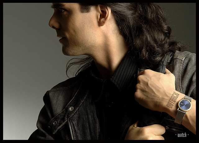
This shot is wonderful! The idea of the watch as a detail is a very good thought! Perfect highlights and the particular light on the neck make it extremely sensual! Compliments! :)
Congratulations on the 5th, though I was hoping this would ribbon!
Pretty neat that you did this with yourself and a timer, and still got such an excellent posed-model like look to it. I really like the mood in this shot... more than just the object, it also suggests the kind of person who ought to wear it... great work!
It's been a while since I submited anything to DPC. I've been extremely busy with my career and had less time to work my way in DPC challenges. The jewelry challenge inspired me to do this shot, and I thought it would be nice to submit something other than what DPCers are used to see me submit. It's kind of my way to say "hey, I can do other stuff too you know! ;-)".
I suspected that the majority of entries would be closeups of jewels, so I wanted to depart from that idea and try to use suggestive advertising. The idea was to create a feeling that the viewer would associate with the product. The downside to this technique is, in this occasion, a much smaller product shot and (especially on DPC at 640 pixels resolution) a high loss of jewel detail.
This is actually an autoportrait. So thanks girls for all the nice comments about the model! ;-)
It was extremely frustrating to shoot on a timer. I hated it because I didn't have control on the composition; I shot large and cropped after. I did about 75 shots, many of them facing the camera, some of them on the side like this. I went for the shot that suggested movement in it.
I'm happy with the lighting. This is pretty much what I had in mind when I visuallized the shot. This was simple to light:
- Main light source 1 meter to the right, half a meter forward. 4 foot soft box with grid on it (so the light does not affect the bgr.)
- second lightsource facing down on the lower left part of the bgr. A 30o grid ensures that the light does not affect too much of the bgr.
Post editing:
- Cropping.
- unsharp mask.
- slight level correction.
- slight color adjustment to give more yellowish tint to skin tone.
- some burning in the right bgr and around the watch.
- minor healing in on the skin in the face.
- doged a littlebit to whiten the eyes.
- added text.
Thank you to everyone who voted on this challenge, and to everyone who took the time to write comments. I appreciate it.
where are the girls?
im just kidding. excellent shot. for some reason when i saw the thumbnail in the challenge your name came to mind. guess i kinda recongnised you from the thumb in your profile or self-portrait.
very good work
One of my favorites, I know that most shots have the piece of jewerly highlighted alot bigger, but this is just so well done, nice Model and great shot--- 10
I have seen ads that look simialr to this and you did a nice job composing this shot and lighting it. In my opinion, the watch is too far to the right and is easily lost. (6)
One of the more inventive uses of text in this challenge and a wonderfully professional shot, at that. It looks ripped from the pages of some overly glossy magazine. Good luck and nice hair.
This is a great shot of the model who appears to be on the move. But the placement of the watch and the ad copy seems to be more of an after thought than by design.
I love this one. It is beautifully lit, and makes a rational virtue of understating both the watch and the copy in a way that's entirely appropriate to the perceived marketing thrust; men who don't care about flash and value substance. I hope this does well. I'm afraid the voters may see "not enough jewelry" and score it down for that, but I think it's terrific.
killer lighting and background. I like the subtlety. while this image is not in-your-face in the way many advertisements are, it is still direct and its product is clear. I can easily imagine this being in a magazine. the one thing I might want to change would be that I'd try burning in the hand a bit, to put more emphasis on the wrist and watch. (8)
I really like this shot. Even though the watch is not the center of focus you definately know its there. The lighting is superb, excellent profile. One of my top picks. I am still un-decided about the crop, I'm thinking I would like to see it not so tight on the top...but do understand that in a 640x640 challenge that if you cropped it any less that the watch would become smaller and you might lose people around DPC.
Great lighting, mood, tone, crispness, and composition. This would work great as a watch advertisement, imo. I hope you didn't suffer because the watch wasn't shot macro-style. (9)
This works on the level that you have linked a lifestyle with your product very well but I guess that the manufacturers woulddemand their product be displayed more centrally and at a larger size.
Really nice, no OVERBEARING text, beautiful light, I like the implied action...to me this says "this is a busy man who needs a proper watch, not some pretty bauble, he needs a watch that can stand a bit of "toughness"...I get all of this from this very picture, it is also one of the few pictures that has remained in my mind after my initial voting, very effective. If this doesn't win, or at least get a ribbon...well...that would be ridiculous.
Outstanding photo. Well composed, captured and executed. Unique in a very positive way. Understated focus on the watch is dynamite. Text on wrist and below watch fits perfectly. If this doesn't ribbon, I'll be well and truly disappointed in DPC voters.
Not as original as some of the others but well composed and shot. More emphasis on the product is needed, (if you had to put the brand name on his hand like that, you probably already knew the watch needed to be better featured.) Negative space is excellent and would allow easy text expansion. The text you placed is well done (except for the hand) but would need more contrast to stand out more.
excellent photo in any other challenge i would have given you a 9 or 10... but for this challenge i would have liked a closer crop of just the hands and watch. my suggestion would have been just above the shoulder as the top edge and just left of the lower hand as the left edge. 8
This is good. I could imagine turning a mag page and seeing this. Good posture, looks like hes going somewhere. Nice choice of font and text. Very minimal is very effective. This is in my top ten. Good Job
nice job...this is an incredibly striking ad....the model makes you want to know whats going on....makes you search....i only wonder if i didnt inow it was a jewelry ad would i have found the product....maybe converting it to b/w and having the watch in color....again this is just one photographers opinion
Very striking image. The lighting is great. I like the cropping and love the tattoo on his wrist. My only nit - I'd remove the word "watch". I don't think it adds anything. Still this is a 10 for me.
Interesting placement of the text, nice lighting, but not enough details, I feel, for the singular object of the ad. Outback also brings to mind something rough and wild, which the watch doesn't seem to project. I'll do a 7, just because I do think this is a nicely taken shot.
This belongs in GQ magazine! Great composition, movement, good shadow use and I like the way you used the logo on wrist and variations of the grey and black tones; they contrast nicely with the skin of model ....9
There's something really cool about this shot. It works well by using all the elemets in the image. I think they all are in the right places, if I can put it that way. Also, you have presented it nicely.
Very nice Ad! Composition is appealing and strong. I can feel the energy and attitude of the 'trekker' as he moves away. Nice look on his face as well. Lighting is cool, if only a tiny bit too directional. The choice of grey background is a good idea as it gives the watch more power as well. I'd wished for a slightly 'closer' shot since we don't see the watch that much. The writing on the wrist is another great touch, as well as the - Watch - beneath it. Great work! 9
This entry has a lot of style and I think one of the best use of lighting of the entries in this composition. The focus and detail is excellent and the post processing is clean without distracting artifacts.
The composition features the watch near the lower right edge which I think is unfortunate given that this is an advertisement challenge and the watch does not occupy a prominent enough location or size.
Hmmm.... yumm..... hard to concentrate on the watch, but I found it.... for a moment *s*. (The lighting helped me find it). I don't like the "tatoo" on his wrist, but without it, it would be hard to work out what this ad is for since the watch is such a minor element.
Great looking model, pose, lighting. 7
Great photo by itself. Forget about Jewelry Advertisment for a minute. Composition, lighting, focus...all the key elements are right on! I'm mixed as to the value of this photo as an advertisement for jewelry - not much of the jewelry to see. I guess it's all a matter of taste. When I'm buying a watch (which I've done numerous times) I want a little more detail. That's just me. As a photo this should place high with DPC voters. 7 from me. Good luck.





 Add photograph to your favorites
 Add photographer to your favorites


 Photographer found comment helpful.


