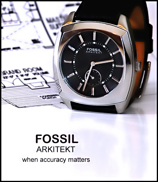
I'm going back and forth on weather or not I like the blueprints behind the watch. My first thought is that it draws attention away from the watch and makes the photo look a bit busy in the upper half.
My second thought is that it does make a nice creative meaningful background for the watch. I guess I'd have to see it without it to be able to make a final decision on that, but I think that you being the photographer probaby know which way it looked best.
Focus and clarity are really good. Nice detail in the watch and the DOF is really good on the blueprint.
The angle is really good, but wonder if the top should be cropped a bit higher to show the entire watch. The part of the watch band I CAN see is orange and if the watch band on this watch is all orange, I would not buy it. I'd want a watch that had an attractive band as well as face. So maybe seeing a little more of the watch band would be a good idea if you were trying to sell this watch.
Lighting is good. There are only a few reflections I can see. On the upper points on the watch face, there are 2 yellowish orange reflections. There is a dark reflection on the upper area of the watch face, and then the reflection from the blueprint on the left side of the face. Not sure how to avoid these, but they could have been lessened in post processing.
I like the text. It's to the point and grabs our attention to make us want to look at the pic more. I think it's a good choice and placement.
I also like the reflection of the watch in the surface it's sitting on. Not sure why, but I think it adds something to the bottom of the photo that would not be there if the reflection were not there. Just a little something that is not distracting, but enough to add interest.
Overall, a good shot, but might just need a bit of cleaning up and maybe a taller crop.
~Heather~
I like the positioning of the watch next to the architectural drawings..it enhances the name and gives it a certain authority and style...very effective ad.
The 10 to 2 position would really have helped out here, alot of people say that watches are not jewellery but I disagree. Having a look through a few watch panflets would show you that the 10 to 2 breaks up the watch evenly and frames the brand name at the top as a somewhat focal point, the shot however is remarkable as there are no hotspots and the small amount of refelction in the white under the watch helps out too. good effor tan hope it does well none the less.
fossil when accuracy matters. This photo - when getting a lot of 10's matter! I can't see this not placing in the top three. Good luck. This my favorite image in the challenge.
Nice composition and good choice of background; I think is help the fill the frame here. Time position could have been better; a ten to two time position would have clear the second dial. Good lighting and good control of reflections.
Here I was about to be critical of your spelling. Glad I bothered to read the the watch itself first. Very well lit. If you could somehow kill the reflection of the watch on the surface, so much the better! 8.
Funny tag line. Needs capital letters.... Very ice composition. I like how you left room on the bottom for more or different text, This ad would be a good starting point and after some text (I.E. content and font) revisions, would work for me
Well laid out and composed shot.
Background compliments the technical aspect, the text works for this shot and I like the lighting inside the band.
Well Done.
Very cool idea! I like the text and slogan as well! The watch is in superb focus sharpness. Lighting is very good as well. I like the background detail as well, giving more 'power' to the watch, following the 'Accuracy' theme! Very nice. One thing that bugs me is the Reflection. It drags away the image and breaks the 'accuracy'. 8
Well done. I would have used PS to elimanate the reflection of the drawing on the edge of the watch and perhaps some of the shadows. But thats me. Still a very good shot.






 Add photograph to your favorites
 Add photographer to your favorites

 Photographer found comment helpful.


