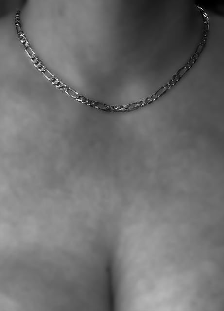
The gaussean blur has created a distraction here as it attributes a rather harsh skin texture. I praise the idea and the concept and with better treatment this can be a lovely image. Bumping up on effort.
this would have been better if you could have selectively desaturated, so that the necklace remained gold. The title is drawing me into gold, and I don't see any. Normally I don't include title critiques as part of my voting, but this challenge was for an advertisement.
Duotone loses the gold tones which would give this photo more attractiveness. Also, IMO, cropping out the cleavage line would distract the eye less and place the focus on the jewelry. Skin seems out of focus.
I think this is an interesting idea, though I would have liked to seen the neclace in color with the rest in black and white, I think it would have more impact that way.
I like the blur in this image to help accentuate the necklace, even though its almost too soft. I do wonder why you chose to desaturate the gold as well as the model. Something tells me this entry is getting a lot of views.
It appears to me that you have blurred the background. Where the necklace (which is in perfect focus -- nice job with that by the way) is resting against her skin, the skin would have also been in focus. But it doesn't appear to be. Thus the blurring makes it look like the necklace has been placed on top of a photo. This effect (whether gausian or DOF) detracts from the impact of the photo in my opinion. Further, I think the composition might be improved by moving the necklace down in the frame ... showing a little more neck to balance the image would improve it possibly. You are welcome to PM me after the voting if you like.
Nice ad as the necklace seems to "float", instead of being on the skin. I like the low crop, simulating one of those ads that beg the question: "Just exactly what's being sold here?" (the necklace or the cleavage?) I think I'd respond better to different DOF, with clearer focus throughout the image. 7
Is the title somehow meant to be ironic? (the photo is b/w, or atleast very low-color). The cleavage is distracting. I would've cropped higher for this particular challenge (but would've gone a bit lower for other reasons.. :)
OK! What is on display here? I believe it may have shown better with a tad cropped off at the bottom. Natural skin tone would have been my first choice. The jewelry is very clear. If you were to stay with this model and this photograph, I feel a longer necklace would have done better. Just my opinion.
skin looks a little mottled... I don't know if you've tried this, but a trick I use is to apply a red filter before changing to b/w... it smooths the appearance of skin
I'm not too sure what to say about this shot. Lighting is poor and what seems like a very off focus doesn't help. Not enought lighting on the neckless makes this pic a not very good seller in a magazine. 3
Why B/W? And why is the skin so blotchy? The necklace does a decent job of standing out - I would think it would stand out more if it was against natural skin color. JMO. Good luck.
Skin that blurry gives an unnatural feeling to this image.
Composition is too much on the botom of the shot vs. the focal point on the top in my opinion. (or was the intent to draw the focal point to the cleavage?)
Detail & lighting on the necklace are good.
I like the soft focus and the necklace is well lit. I would have cropped off the bottom personally. However, the advantage for adding it in are two-fold: helps to define the location and dimensions of the necklace and offers a bit of adolescent sex appeal, which overall does not seem to negatively effect the ratings here at DPC. The lighting is a bit irregular on the right breast (the one on the left side of the picture) and therefore gives further cause to have either edited it or cropped it out.
The model's skin as a side note is blemished a bit due to the freckles which detracts from an advertisement point-of-view.
The lighting is ok. Don't read any futher if you are of a delicate temperment.
These are just a few things I see that could be improved. Mind you, I'm not an expert. The drastic change from in focus to out of focus is not pleasant to look at for more than a few miliseconds. The necklace looks silver. I think the product doesn't get it's share of real estate. The composition is static. Hope this helps. Keep shooting.
Nice image. Skin looks a little odd - like there was a lot of detail, and that has been seriously softened/blurred. Not sure if I like. Missing a little light on the nape of neck area - maybe need another light source?
Sorry - I don't see any gold. But I do see some bad noise on the models chest. Maybe the lighting - just not very flattering. If you were going for the gratuitous cleavage points, I can't even give you those. :(





 Add photograph to your favorites
 Add photographer to your favorites


 Photographer found comment helpful.


