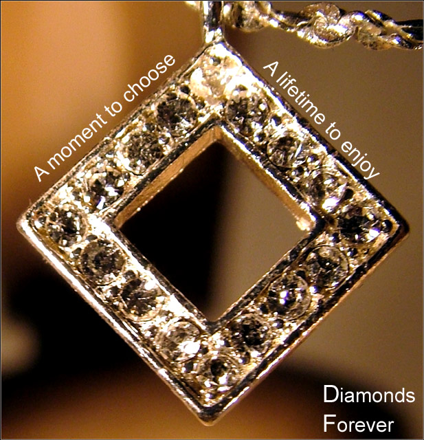
This shot seems to be suffering from some digital artifacting...those jagged edges. Also, the lighting is harsh, making it difficult to sort out the fine detail of the shot.
To photograph one diamond is difficult. To take on this many may spell failure if definition and clarity is sacrificed. The layout is nice. Bumping up.
Maybe it is just me, but it just seems a little blurry to me. I also think that a solid background may have put more of the focus on the pendant rather than trying to figure out what the background is.
I don't know if it is the lighting or the focus, but the diamonds are really hard to identify. The background is very distracting, maybe a contrasting color would have helped.
Neat idea wrapping the text arond the object. The jewelry piece itself is a bit bright and the detail of the stones is lost. Good luck in the challenge.
Composition works for me, as well as the text layout.
Personally the font used could have a little more feminine flair to it, which would soften teh feel there.
I'm sure you have received comments about the lack of detail here and can only suggest less of a crop, not shooting too close to the subject, a smaller aperature (if available).
Decent attempt at a difficult subject. (5)
Very origianl and I llike the way you used the shape to place the text. Great dof but the peice itself needs to be crisper as it is what you're trying to sell.





 Add photograph to your favorites
 Add photographer to your favorites


 Photographer found comment helpful.


