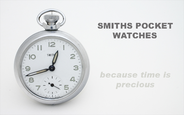
This image was taken with a home made studio box and a 600w light. I used blue tack and matches to stand it up and it kept melting and falling over and generally annoying me. The picture was straightened and cropped and then text was inserted. No cloning involved!. Unfortunatley when I resized the image for entry the text went all jaggy. Bummer
Statistics
Place: 36 out of 159 Avg (all users): 6.0364 Avg (commenters): 6.9688 Avg (participants): 5.8182 Avg (non-participants): 6.1824 Views since voting: 1197 Views during voting: 394 Votes: 247 Comments: 40 Favorites: 0
Critique Club:
This is a clean and well lit picture. There is something under the watch. Not sure what it is but I can't take my eyes off it :) And I would like to see the edge of the watch cleaned. Overall this picture is very good. Weel executed studio shot.
Your photo is so crisp and clear, but-----
Your text is blotchy, Only on the top, I wish you would have picked another font!!
I stilll think this ranks in the top 10-- my vote is 8
This is my only nit that I have to pick with an otherwise very well done shot, the hour hand is partially covering the name of the manufacturer. You should have set the time to 10:10 to frame the name. Other than that, well done. 7
My eye keeps getting drawn to the red car in the background.
Coming back after challenge, This is a comment I left on another photo, actually in the minimalism challenge, I was voting on both and my browser started going crazy lol, I apoligize for this. I'm sure you were confused at my comment! LOL
elegant layout, nice product, good focus and details, i like the overall lightness of the ad and the two tone text use. a different font would work better with me, perhaps. 8
Good lighting; no shadow, no reflection. You should have positioned the hour hand to not obscure the watch maker name. I can't see this picture as an ad with the watch maker name partially blocked.
That text is tricky isn't it? ;^) Very good capture on the watch. Nice lighting and focus. I wonder how this would have looked using a black background? Good luck in the challenge.
Nice Job! Fantastic comp and Text Placement. Direct and to the point, no doubt what's being sold. Bottom font color needs to be darker (maybe both) and capiltalized.Good message.
Too light and blends in with the background. I believe the pocket watch would show itself better if not so light and perhaps a different background color.
Very clear, simple & uncluttered submission.
Nice job on the lighting here. Only suggestion would be a different font for the main title, such as one that looks similar to the watch face. Good shot regardless.
Very nice composition. Lighting is simple but efficient. Its nice to see the white background is mastered, with no yellow burns around the shadows. The text is simple and catchy, but suffered because of the image compression (all the curves). Also the second part of the text is kind of odd, as its disapearing, making it harder to read. One suggestion would be to reshoot without hidding the "smiths" on the watch. That's the important part of the watch, which is partially hidden. GW. 8
Fantastic. Great tagline also. Only thing you might get ding'd on is the fact that one of the hands is covering up the name on the watch face. I did the same thing without realizing it. :(
Top 20% no doubt.







 Add photograph to your favorites
 Add photographer to your favorites

 Photographer found comment helpful.


