Author Thread
Post actions
Whoa - Tiffany?! Looks like you're high maintenance!
Comments Made During the Challenge
Post actions
A very resolut composition with a direct message and good capture. Bumping up.
Post actions
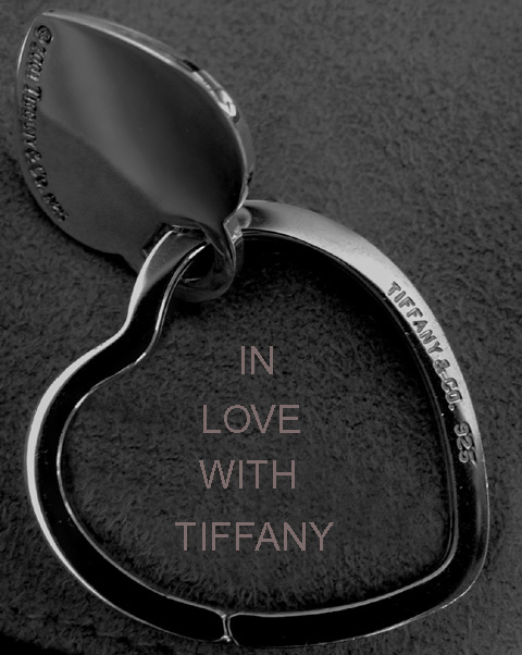
This is a great shot but the text is distracting. Either a different choice of font or no text at all could have improved the entry.
Post actions
Just a tad more space at the bottom would be better 7 the crop is a little tight IMO.
Post actions
Post actions
I like the composition and lighting. The text works well with the ad as well.
Post actions
I wish the lighting had been more on the jewelery. It would be nice to really see it lit up. the clarity on the jewelery is nice. 6
Post actions
A decent composition and tone acheived here. Subtle, soft, filling the frame and well lit. (perhaps a little too tight of a crop, especially at the bottom)
Post actions
Could have use a little more light.
Post actions
a tad dark, nice framing though.
Post actions
Why B/W? This is a very interesting piece of jewely, should be bright and happy...this image is coming off a bit dark to me. Text is hard to do if you're not used to it - looks like you upsized the text after inputing it, then it becomes jagged on the edges. Good luck in the challenge.
Post actions
Post actions
Let down slightly by the poor text.
Post actions
I love the shot but don't like the text font or placement. I noticed that the font matches Tiffany's but I still might have gone with something different or in script (Park Avenue font, perhaps?) 7
Post actions
Great crop and Idea! Nice comp, needs more contrast to show the brilliance of the piece. I'd change the funny font with pixel problems
Post actions
Crop is a bit TOO tight IMHO.
Post actions
image is a little too dark but the overall image is good for an ad
Post actions
Image seems a little dark and doesn't the jewelry shine IMO
Post actions
Image looks a bit gray overall.
Post actions
Post actions
The lightings good..maybe a different background ?
Post actions
I don't think the text enhances this image. . .5






 Add photograph to your favorites
 Add photographer to your favorites

 Photographer found comment helpful.


