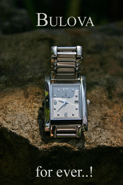
I really like goals like this. A simple image could be the greatest moment. A litle clone to put out a spot on the rock was made. Letters added as roles permit. Rezise for requirements. Shadow adjust to clear up the rock.
Statistics
Place: 55 out of 159 Avg (all users): 5.6917 Avg (commenters): 6.7273 Avg (participants): 5.4752 Avg (non-participants): 5.8355 Views since voting: 1230 Views during voting: 385 Votes: 253 Comments: 51 Favorites: 0
Thank you for entering the DPChallenge, Jewelry Advertisment.
Great capture. The choice of the watch and the rock creates a great appeal for your product. The light and dark tones also create an atmosphere of interest and uniqueness. The darker area's was a great place to the place the text. The entire photo scene almost feels like its near the beach, or a body of water. Your use of the frame and space, to position your watch is good. Your typeface, or font selection also gives the product a lot of class and value.
You have done an excellent job composing and photographing this ad.
Technically there are only some minor comments to make. One is the focal point of the watch. There is some blurrness in the center of the watch. The brand name "Bulova" is not "camera ready" sharp. The product name should be as clear as possible. Also the calendar date feature is also out of focus. There is a minor distraction on the left side of the watch face. Sort of a green color cast. This takes away from the silver coloring/material of the watch. There is also a shadow on the upper half of the watch's face which creates some distraction.
I am sure that you have notice newspaper and magazine watch ads. They set the watch to 10:10. The reason is be able to showcase all of the watch's features at a glance.
Like I said your typeface is an excellent choice. The title however probably does not need a ..! at the end. Bulova watches are very classic, elegant, and have very traditional style. The exclamation point is a cause for uneeded attention. Probably just ending it with three ... dots, would have suffice. You might get a difference of opinion here, but that is generally the advertising and marketing approach.
Just curious did you use a flash? Looking at the shutter speed of 1/500, I was wondering what light source you used?
Overall an excellent and well composed shot for the challenge.
Thank you very much to Daniel Cuesta, Michael Jewell, Nathan Pert, Paul Marcus, Catherine Balck, Nick clark. LPSNZ, Sonja Foos, Robert Mann, Michael Price, David Robinson, Martin Smith, Darren Coleman, Benjamin Cox, Nuno Monteiro, Roberto Garcia, Andrea Allen, Rob Go, Barry Baugher, Sam Northrop, B.C. Cutre, Nick Monu, Stephen Brubaker, Dexter Balyeat, Scott McAndrew, Joey Bramlage, Shari Malin, Sandy Powers, Lesley goodman, John Smith, Brad Petersen, Sally Phillips, Christina A, Teresa M, Louise Brien, Charles Cook, Yvonne Vetrone, Alyssa plano, Danetta doncel, Francois Plouffe, Steve Weaver, Rachel Dye, Sonya Thompson, Srdan Zirojevic, Todd, Tim Cady and tree Hidden people, who wrote comments on my picture “Bulota for ever..!” in Jewelry Advertisement Challenge. I do appreciate all recomendations and really did learn about shadows and ligthing.
To get 47 comments and suggestions from all of you in my picture is for me more than to get a ribbon. Thanks again and I fell this time was a school in my introduction into the photography world.
As soon I saw the shadow in the top of the front clock and the focus a bit out, it was a challenge fot me to get a better shot; and here is the result. What do you thing?
10 to 2 position would really help the face to break this up and proportion it somewhat better. like the element with the rock as it tones up the watch but an overall lack of focus on the hands and brand name of the time peice itself spoils thi sa little but a great image none the less.
Lighting problems. Location of light doesn't highlight in a natural way the glory of this timepiece. Timeless lighting is a bugger I'll admit. Great setting. I love the contrast of rock and watch.
I wish the lighting had been more on the watch face. I like the setting of the shot. I like the dof used. maybe a smaller pen light pointing up or a larger light to the left with some paper in front to prevent glare. 8
Cool props - I like the rock. Lighting is ok. Focus on the watch seems off a bit. What is that reflection on the left side of the watch? Looks like sunglasses. ;^) Good luck.
Nice idea comparing a watch to a rock. Beautifully photographed. Quibbles: I'm wondering if it should not be 'forever' and if the balance would be just a bit better if the font face for this word were just a smidge smaller. Finally, I kind of like those dots, but wonder if the exclamation weakens the claim by cheapening it.
Wow! very nice. Attention to detail as I believe that you've found the "official Bulova Font" Nice comp and clarity. One small revision i'd suggest is the text on the bottom needs to be larger, capitalized and one word!
Well thought-out composition.
A couple of things I see that could have been improved:
The upper part of the band is casting a shadow on the watch face and the lower text size is a bit too large in my opinion.
Good submission regardless.
There should not have been a shadow over the face of the watch.
having the time set to 10:10 would have helped (as it is a de facto standard for watch ads but haven't impacted my score at all).







 Add photograph to your favorites
 Add photographer to your favorites


 Photographer found comment helpful.


