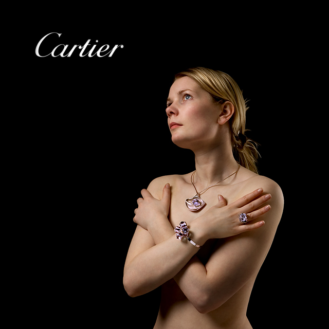
Arnit, your model is truly gorgeous and it is a lovely photograph. However for this particular challenge I think that we need to see the jewelry a little bit more clearly. I also find the left eye a tiny bit disconcerting as it is split by the nose. Your technique is unquestionably excellent, it is just the interpretation that I question a little this time.
The lighting on your model is too bright. Could use some softening. I'm not sure her hair pinned up in that back would pass for a glamour shot. I wonder if a tight crop from her lips to her elbows might have worked...???
Beautifully lit. I'd have toned down the white of the type to something more in balance with the overall tone, and used a little less negative sapce, both type and subject seem a bit lost in all that black. Of course, if there were more copy being applied, the black sapce might integrate better...
Lovely trio of jewelry on this beautiful model. The warmth of skin tones against the dark background works very well, especially since the model is in the gesture of "warming up" (or is she simple "covering up"?). Great work Arnit. All the best to you.
Nice skin tones, good light and crisp iamge, the only one improvement I can suggest here is that your models hand is a little on the rigid side and looks uncomfortable. Picky I know but the photography is brilliant. This should do very well.
This is an elegant picture and a well thought out composition. My only suggestion for improvement on this is to relax her left hand and allow it to fall in a more natural position. 9
Very nice...Though there is a model, I know it's about the jewels...seems pretty obvious to me....I bet you've had comments saying otherwise.... The text enhances the image and gently guides the viewer...and thank you for using a proper font... Beautiful light, lovely skin tone, perfect color.
Part 2: Moving on up to a 10, looks like something you might see in nicer fashion magazine, simply elegant.
I like the lighting, black background and simple text. Nice model. I also like the fact that your model only wears the jewelry, even though the jewelry are small, they attract a lot of attention.
Pretty girl. Nice jewelry. Great technically. I can really imagine this in a high end magazine. It would fit perfectly in Conde Nast Traveler, for example. Congratualations on a superb image!
closer up would have given it a more abstract feel with skin and jewelry which would have looked really cool imo. But nevertheless this is a well taken shot.
A very nice visual, yet a more gentle curling of the fingers in the right hand would have increased the power of this image The other way to add more power would have been to adjust the camera angle to eliminate the top of the lid as it peeks in black over the ridge. Please, take this with a grain of salt, these are touches that are not going to take credit away from your wonderful effort. We are only talking small degrees. Bumping up.
Yes, sex sells and you grabbed my attention with the well exposed lady (pun on words intentional). Very good lighting and details. The jewelry pieces look interesting but can't see enough of them to appreciate...
This is such a great photo and I believe that I recognize arnit's model.(whose skill I greatly admire) However, I don't get the sense that its an ad for jewelery. Maybe for skin lotion. Technically its perfect. but I don't believe it would sell the bling/bling.
Hmmm. I've seen this lady before. ;-) You are making the best of a very lovely lady. I like the tack sharp focus and your placement of her in your images. Also the color and lighting are perfect. You may win another ribbon with this one.
I'm sorry if I'm a bit harsh, but I feel you've botched this shot by using too much jewelry and/or using too flashy jewelry!
If you had used just the ring or just the necklace this would have been quite nice photo but as it is the photo is too tacky - the bracelet, in particular, should not have been in the photo. A less pronounced color could also have helped here.
The lightning is quite nice and so is the model, of course!
I don't like the shadow falling off the necklace - quite distracting.
I also feel there is too much space above the 'Carties' text.
Nice photograph overall but I feel it could have been much better!
She looks a little different without all the tacks on her face this time. LOL
(Sorry if that isn't Audur Sigbergsdottir - sure looks like her)
Nice job on the lighting and detail! Not sure if the composition works all that well for me, but still a great image regardless. Well done!
Excellent lighting, but perhaps you could have cropped closer to the jewelry while maintaining her figure in the frame to accentuate the jewelry better.
model looks very familiar ;) - you got the font just right, really like the black background, very eye-catching composition, would like to see the jewelry better (closer) ... as presented one of my favorites
Cartier? I thought it was "Gawdy" ;-) Sorry - it just looks huge and overpowering on a naked woman. Not even sure what she would be wearing with that huge of jewelry. Obviously your portrait is very good though. Good luck.
Here's a good example of a shot with great potential that needs just a touch of tweeking to make it really work. Cropping very close to the model might help in this case; there's just too much negative space to support this beautiful pose. Also, the lettering of "cartier" is way too big and distracting. I'd also revise the color for the font and possibly go with a very light gold that would reflect her hair. Lighting could use a bit more contrast for more dramatic effect in this shot. The model's right hand could have used a slight relaxation in her fingers, just to give a more natural feel to her pose. And finally, when a model looks up like this, I always suggest that she opens slightly her lips: it always seems more relaxed and very sexy. Sorry, don't mean to down you dude. I think you did great as it is and I see you have great potential; I wish you well and good luck with improving your skills.
Perfect lighting and truly stunning model. Very sensually done, but so that the emphasis is, correctly, still on the jewelry. The colour in the gems has also come out well. 10





 Add photograph to your favorites
 Add photographer to your favorites

 Photographer found comment helpful.


