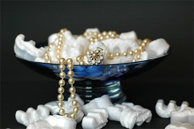
Two black cards as background. A small glass bowl and some plastic protective "popkorns". Shot with the Nikkor 1.8D 50mm. Natural window light at f3.5 1/60sec.
Statistics
Place: 131 out of 159 Avg (all users): 4.8862 Avg (commenters): 5.0333 Avg (participants): 4.7723 Avg (non-participants): 4.9655 Views since voting: 1129 Views during voting: 362 Votes: 246 Comments: 33 Favorites: 0
This is an interesting idea, though I'm not sure I understand the purpose of the packing peanuts in the shot? If that is what they are, they distract from the neclace and don't really add anything to the photo in my opinion.
the foam "peanuts" really detract from this photo. If this was an ad I saw in a magazine I would do anything but buy these pearls. A more neutral display using white velvet or even white tissue paper would have made a better support for this image. I like the idea of the glass piece, just not the "filler" used.
the styrofoam/polystyreme peanuts seem a little incongruous in this context and the bowl is rather centered which to me at least breaks the natural flow of the pearls. A lower POV might have rendered some interesting reflections in the bowl and you would have had a shot with an original message. For me I don't think this quite achieves the effect you are looking for in an ad.
I like the bowl, I like the background, I like the jewelry (although I would like to see it closer) - what I don't understand is the packing shells (foam peanuts)?
'immortal'... is this you mocabela :-)
good photo, not sure im a fan of using those things from packages (cant remember what they are called) as part of the photo but interesting result and technically really good. 8
The incongruity of styrofoam packing peanuts, IMO, undermines the photo both visually and thematically. Love the bowl. Love the necklace. Nice lighting.
Cute idea. I like the bowl, unfortunatly the composition makes it off to the left. Lighting is weak and doesn't give enought energy to the shot. Also, the jewel and neckless are too far away. This is not something that would appear in an advertisement magazine. Carefull in the crops, as we can see impurities like on the lower left corner. 4
The spelling error in the title is no biggie and to me isn't part of my vote here.
The shot is decently laid-out with a good control of the lighting.
Disregarding the title spelling for a moment, there is a clash in the text vs. image as the styrofoam packing "stuff" doesn't say immortal (well maybe if the fact it doesn't decompose) and think a different material could have been chosen.
Sill a good shot regardless.
I find those styrofoam packing beans a very odd choice for this display, yet somehow it doesn't look half bad. You are showing real flair in your presentation, the dish is a great choice with those pearls. Good composition and DOF. 6
Love the setting and dof. The lighting is good. In my mind, the stryofoam peanuts imply if I buy that necklace, I'll never have any money to do anything else. I'm not an expert, but this might be something you might want to try if you reshoot. Same bowl, same pearls, same background and same lighting. Use popcorn as the filler and as a prop, use a picture of an old b/w movie star. If they are real pearls, you might not want to use greasy popcorn because the oils wouldn't be so good for them. Move the bowl to the right of the frame.
great concept. The stryofoam peanuts don't do it for me however. Perhaps if you had used polished river rocks of about the same size, black ones perhaps, to contrast witht he pearls?
I like it! Except the "popcorn" seems out of place, though I know what you were trying to accomplish. Having a hard time coming up with a different subject to replace the popcorn myself.





 Add photograph to your favorites
 Add photographer to your favorites


 Photographer found comment helpful.


