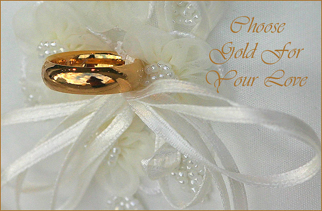
You've captured the ring and backround beautifully. It looks like you ran into one of the challenges I noticed when shooting jewely--the reflected background. As I look at the reflection, I'm curious, did you shoot this in a window display? If so, I'm impressed. If there were some way you could shoot it without getting your own reflection in the ring, that would probably make that part of the reflection less distracting and more ambient. I also like your font choice and position, although the lightness of the chosen color makes it hide somewhat. (7)
Very nice lay-out, similar to how an advertisement would look. The lace is a nice compliment to the overall effect. Shame about your reflection in the band, but suchis life in an open challenge. (6)
The idea and composition are very good. I can see you took this outside to gain maximum light, its a shame your reflection together with the background and sky is sheown in the ring.
A light tent would help manage reflections
Nice crisp shot of the ring - I do not like seeing you in the reflection - It would have been awesome if the reflection was a bride and groom - so you could hide the cam - It would have easily been top 5! Bumping up anyway! 8
Good concept; nice blend of gold and white. However, it looks like the photographer's reflection in the ring (if you could have somehow worked that out to be a couple embracing in a kiss, that would have relected wonderfully!) 7
Looks like a greeting card. That's a compliment. Very nice composition. Nice look at the photographers reflection in the ring too! ;^) So close... Good luck in the challenge.
Great comp! The colors jump out at me, the subject is very crisp, but the details need revisions. I'd suggest a different font with a different color (darker and larger, even though I can see what you're trying to do here.) Also the DOF make me feel as if I'm looking at it sideways.
I like this and I feel it would make a good ad. The lighting is soft and flattering and the picture was processed very cleanly and without artifactual distractions. The reflection does not conjure images of heaven for me, and perhaps you could have incorporated this theme into your advertisement writing rather than in the title.
Not saying this would work better, but I would suggest "Heavenly gifts for your love", and to further direct the voter, leave the title as-is.
Alternatively you could have chosen a more difficult route and shoot for a cleaner reflection (i.e. without those odd lights points or perhaps without that vaguely house-like structure?).
this set up or display is beautifully thought out....a great add however once i caught your reflection in the ring i lost concentration on the product....good luck
Very very good looking photo ! I love it, but I think it's a little oversharpened and I don't think it's a good thing we see your reflection in the ring ....
I think there's too much thing reflecting on the ring. I don't know if it was what you wanted to achieve. Is this really the sky and a house showing on the ring?
your reflection inthe ring is a bit distracting. otherwise, great image, ecellent lighting and focus, good use of text , just the right choice in DoF. Good job - 8
Very nice colors, but we are not supposed to see a photographer in an advertisement for a jewelry. Got to take a point or two for this bad lighting/reflection issue. 5.





 Add photograph to your favorites
 Add photographer to your favorites


 Photographer found comment helpful.


