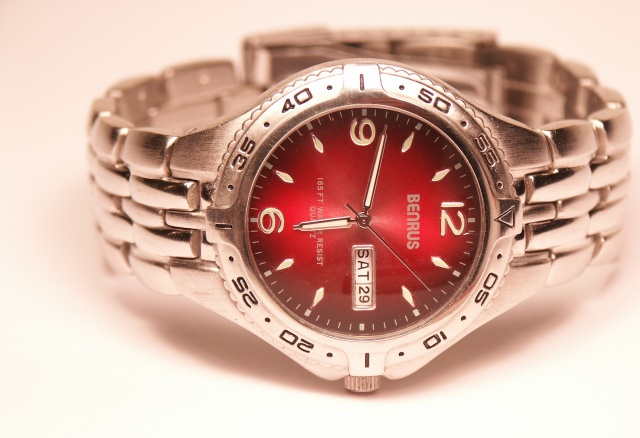
Took this shot in a psuedo studio setup at my place. Managing the shadows is tough. The little bit of reflection on the glass face of the watch is the only thing I'm not quite satisfied with.
Minimal post processing:
-Cloned out a few specs on the glass face
-Cropped
-Resized
Statistics
Place: 46 out of 159 Avg (all users): 5.8151 Avg (commenters): 6.2308 Avg (participants): 5.7500 Avg (non-participants): 5.8592 Views since voting: 1095 Views during voting: 357 Votes: 238 Comments: 28 Favorites: 0
I find the composition a bit off, as its not even, but the watch 'wants' to be in the picture. Also the lighting is very yellow for a silver watch (was this shot in RAW?), the colour temperature is too strong and could've been cooled down some. The Time displayed is good but could've been better to be able to read what's writen. Sharpness is good, but could've been slightly better. It also seems the lighting is a bit too strong (or too close?) to the watch. How many spots did you use? I'd suggested more Wattage at a lesser distance, or a Soft-Box. DOF is good. 6
I like the soft, diffuse lighting and you did a nice job in controlling the reflections. Not sure of the composition though. The crop leaves some awkward space on the left that is too small for any print lettering. Almost as if you did so to prevent a centered composition. Sometimes centered is preferable. I would suggest leaving more rorom either above or below, which would naturally follow in this type of ad presentation (landscape aspect ratio).
I take it the red cast is intentional? I like the photo in general. The off-centering of the watch I'm not so sure works in this case because there isn't enough negative space to the left - it looks like a mistake. Good lighting with the highlights and shadows. Just noticed, something is reflecting in the watch glass face starting from just left of the date over to what would be the 1...
This is one of the finest lighting setups in the challenge and an excellent subject as well. I think the watch face would really stand out nicely if it were a bit darker, but that's a small critique of a very nice image. BTW, you might get a DQ request or two because of the date on the watch. ;-)
I think this image would work better rotated 90 degrees left and the background tinge of a color which would high light the red face. It almost looks like the red has bled through the image, just my 2c worth 6







 Add photograph to your favorites
 Add photographer to your favorites


 Photographer found comment helpful.


