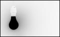
I think we miss the grain of the wood in this shot. It has many strong elements to it - but part of minimalism, for me, should be the subtlety of variation - and the patterns of the grain would make an ideal addition to this one. Your ladle would retain it's strength as obvious subject, the heavy lines of the gaps between battens would give a grand and basic framework, and the regression would be more complete, to my eye. it has the look of your having over-done certain channels - the way the colour has lost detail below and to the right of the ladle suggests over-exposure is to blame.
Oow im SO craving a sauna right now!! Funny detail, first time i saw my current girlfriend was in a sauna :)
The colors and focus looks good and it meets the challenge, the grain works for me.
i really like this shot ....i like the warm tones and the fact that even though the subjec and the backround are in the same tones you have no trouble identifying it...the only change i would make is cropping it at the break in the boards...it distracts the eye a bit at the seam ...other wise well done
I like the colors and textures of this image. Placing the ladle (not sure what it's really called) at the top creates a lot of dramatic tension. That seems to conflict with the more soothing tones of the copper and wood. I wonder if rotating this 90 degrees counter-clockwise would resolve that.
I like this, to meet conteporary minimalism it would only neet the wood of the upper part of the picture by getting rid of the lower 2/5 of the picture. 9







 Add photograph to your favorites
 Add photographer to your favorites


 Photographer found comment helpful.


