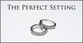
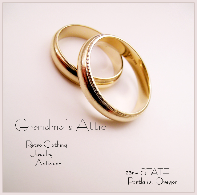
Nice work! Sharpness of the rings are nice, and the DOF is good as well! (5.6?). Text is a bit wierd, probably suffered too much from the compression, but that's ok, in a mag, it wouldn't show like that so its forgivable ;) All i can say is thank god for Macro..(?!). 7
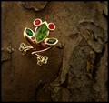
Good stylistic fit between your subject and type of "store" you operate. Typography works, although I'd have moved "Grandma's Attic" down and left just a tiny bit to get it more completely out from under the shadow.
Very well done. makes me want to go visit this shop. The lighting is good because there is no big glare on the ring. the saturation of the rings is good also. Very nicely done 9
Very good composition. Rotation really make this picture work. Lighting is well controlled. Soft shadows are nice. Dark refelctions in the rings a bit distracting; looks like the photographer reflecting in the rings.
Excellent entry and among my top picks. Ultra light font is terrific but is somewhat pixelated. In a real ad, you'd want to lay the text on top of the photo in a program other than Photoshop. For the challenge you did about as good a job as possible with it. Congratulations and good luck.
Can't see much wrong with this one, but I can see lots RIGHT. Composition is good, lighting gives good shape to the rings, and I also like the small depth of field. 9
Crisp shot and great comp. Font should be fatter (is there a bold? or ad it after you save for web) I can't figure out what you're doing with address and why it is consistant. But I like this ad.
I like many parts of your image, but together they don't quite work. Grandma's Attic with two wedding rings (they don't seem to go together). The "Attic" text is too close to the rings. The border works very well.
Nice lighting. Not a big fan of the font you used for the writing and appears to be too sharp (aliased and jagged). Love that border and overall a great entry. 7
Hey - what's so retro about that ring?! It looks like mine and I'm not a grandparent yet! ;^) I like your choice of text. The gold color cast to the image is appropriate. the lighting and exposure is well done. Good job!





 Add photograph to your favorites
 Add photographer to your favorites

 Photographer found comment helpful.


