Author Thread Comments Made During the Challenge
Post actions
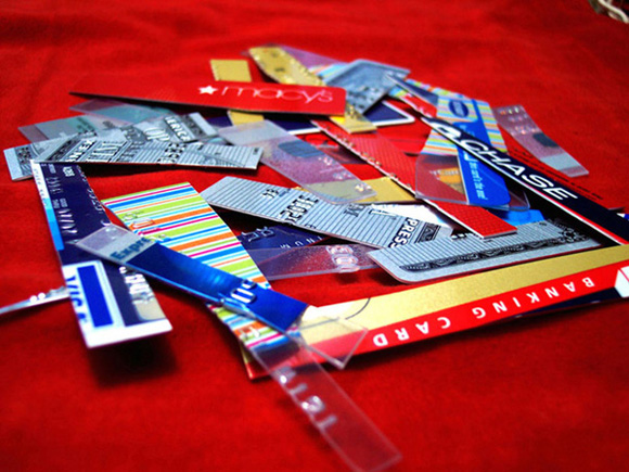
If the DOF directed my attention one of the card fragments I could see this as minimalism. I like the image, but it doesn't meet the challenge.
Post actions
the top right corner is distracting, also, it feels like there should be more card shards leaving the frame, or there should be none at all
Post actions
Don't think this fits "minimalism
Post actions
Doesn't meet the challenge imo.
Post actions
Credit is evil! This rocks. This says Minimalism!
Post actions
Interesting idea, but don't feel it meets the challenge.
Post actions
Post actions
I find this hard to interpret as minimalism
Post actions
I think a few slivers of credit card would have been enough. There is just too much going on for me. 4
Post actions
please explain? I do not understand this image at all :/
Post actions
Post actions
wouldnt mind doing this more often
Post actions
Ouch that hurts, no more camera gear.
Post actions
no strong subject in my opinion but love the coloring
Post actions
Nice bold colors. Sharp image. But, it doesn't meet the challenge very well. The subject should occupy a "very small portion" of the image space. The cut up cards seem to be the subject, and they occupy nearly the whole frame.
Post actions
Nice color. The subject takes up more space than I would like to see in a minimalism photograph. Just my opinion. Great idea for a New Year's resolution challenge.
Post actions
Post actions
I think the picture was supposed to show something small or outstanding and being only a tiny part of the whole picture.
Post actions
i see nothing minimal here
Post actions
With no strong focal point, I don't think this fits the challenge too well.
Post actions
Subject is not simplified enough. It might have looked better with just one piece of the credit card against the red background.
Post actions
A question I wrestled with in this challenge was whether 'a very small' part of the image could be 'not visible at all,' decided it wasn't. Not sure this photo captures any of that invisible risk. I like the choice of backgrounds, find the arrangement a little cluttered for my tastes.
Post actions
Feels a little busy for a minimalist piece, but nice all the same






 Add photograph to your favorites
 Add photographer to your favorites


 Photographer found comment helpful.


