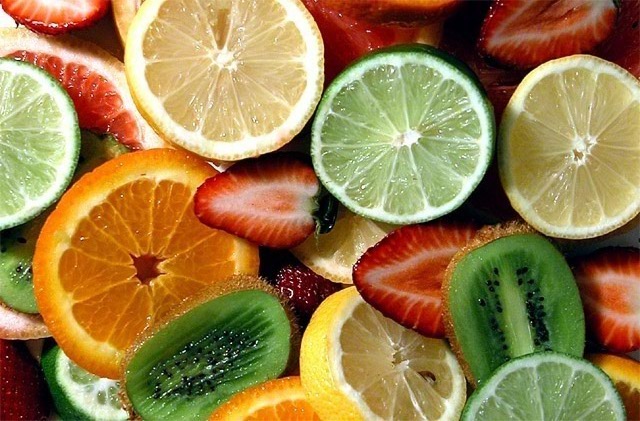
Composition - Nice array of fruits with some good colors involved. The arrangement is good. The first 2 things I notice about this is the bottom left corner and top right corner are a little blank. You could've filled in these "holes" with some lighter colored fruit or cropped them out. I think the strawberries should definitely stay over top of the citrus fruits to provide some contrast. The one on the top right is almost invisible. Generally the composition is good.
Technique - I think this could've used a slightly slower shutter or a little more light. I guess I'm trying to say it could use a little more exposure. I don't think its "dark" but the colors would benefit from a little more exposure. The focus is great and there's no apparent problems with the DOF. If brightening this up a little didn't make the colors stand out a bit more, saturating them a little more with PS or equivalent would be another option. For that matter you could've brightened up the pic a bit with PS, but a little more exposure would've been preferred.
Overall - I like the photo but would like it better without the dead spots. The colors should really be jumping off the page to really maximize the visual impact of the piece and really grab the viewers. I really think the potential to this pic is here, it just needs a little kick in the pants to make people stop and really look at it. It's a good photo as is, but could really benefit from a little more exposure and color with a little tighter crop for good measure. Nice work and good luck in future challenges - Inspzil
Being a New Zealander.... i will give you an extra mark because you included Kiwis!!!!!
Nice composotion.... but could have bumped up the colour levels a bit..
Great approach to the challenge... I would have preferred to see a bit more saturation, perhaps through different lighting, to create a more engaging shot.
Wonderful shot of the fruits - I like that they are all facing the same general direction and that we can't see the backs of any (exception being lower left corner) What if the lighting was a touch brighter or the colors a tad more saturated? 9






 Add photograph to your favorites
 Add photographer to your favorites


 Photographer found comment helpful.


