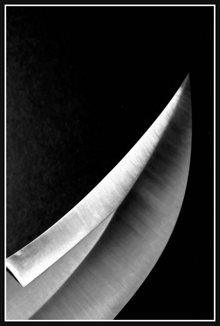
Minimalist in the pure sense, and a lovely "abstract" as well, but failing to meet the challenge as the subject is taking up too much of the picture area, IMO
This picture is nicely done. Good texture and lighting. I just think that the subject takes up a little bit too much of the space to meet the challenge. 9
Another who took the alternate route on this challenge. Yes, the subject probably takes up more space then the background and it that respect goes against the challenge description, but it is still a minimalistic photo. And a very nice one at that. Good job and good luck!
So many people try this kind of stuff, and just fall over and end up glancing around sheepishly hoping that no-one noticed. This has a touch of a master's hand behind it, I would say. My only reservation would be about the levels on the foremost blade - touchingg on that borderline between white and grey, for web display, I think is very difficult, and on my machine this goes a little far.
Minimalist in the classic sense, at least, if not the contest sense, so no points deducted for that. The pure black background is tedious, however, though the texture on the knife is interesting.







 Add photograph to your favorites
 Add photographer to your favorites


