wow nice, the lettering and numbers seem slightly soft though. maybe try applying unsharp mask in ps? i dont know why im giving you critique after the challenge is over, but i just figured it might be helpful =/
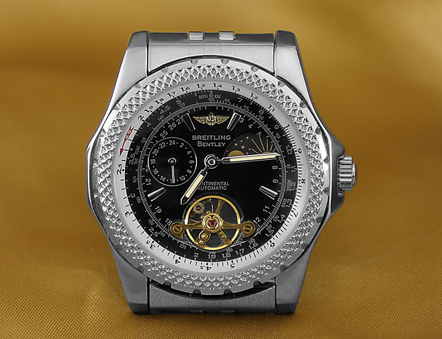
I loe the watchhead, but for some reason, I'm not sure why, the background distracts me. Like I said, I don't know why, but it does. I'm still going to give you an 8, with probably bumping it to a nine later.
nice complimentary background color and great detail on the watch. the composition is a bit static being centered. more background and offsetting the subject might have been better.
Good job managing the reflections, and it looks like you even desaturated the reflections in the watch (either that or you colorized the fabric), or your watch is so expensive that it only reflects in that nice silvery color. As far as the photo, it is very sharp, but the composition is a little stagnant with the watch being centered. I'll be utterly nit-picky and say that I wish the hands of the watch had a different orientation. By the way, how many years did you have to go to school to learn how to fully utilize this watch?
nice image, only slight thing - try setting the time forward a few minutes such that the the hands are in a more balanced position - hope you do well :)
Nice picture. I like the background you have used here. It compliments the watch brilliantly. Good control over the reflections too. I would have liked to see the watch srtap but definetley in my top 10 for this challenge. Good job
Nice time piece. Good lighting. Love the background color in contrast with the watch. Good use of DOF, watch is sharp. Composition a bit static however. Would have been good to see the watch bands since bands are really an integral part of watches of the caliber. I don't recall ever seeing a watch ad where the bands are not visible.
Very clean & sharp image.
A little more band showing would have helped this out in my opinion, along with a slight angle to it perhaps? (Seems a bit too static) (6)
Very well captured details. i see what you tried to do with the background color to complement the gold items on the watch, but to me it doesn't really work. Something in the silver or bluish tones might have made the watch stand ou more... I don't know. Also, the center composition seems to be missing something for me. Overall well done. Good luck!
Beautiful image, the lighting is wonderful, and the background really brings out the gold in the watch, would have rated a 10 if you had just smoothed out the tiny wrinkle to the left of the watch. Wonderful image. 9





 Add photograph to your favorites
 Add photographer to your favorites

 Photographer found comment helpful.


