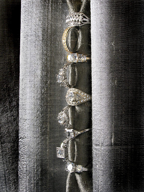
What I was after in this picture was understated elegance with a hint of luxury...I wanted to be anti-obvious...no macro, no plain background. Silk dupioni is an interesting fabric, the way light dances across it is amazing, the way the color shifts due to the crossweave, I have been using it alot in my textile projects. They are not curtains, just scraps laying around in my work room...this photo has not been desaturated...that is the color of the fabric and jewelry. I had fun trying to come up with something for this challenge. I got bored one day and decided to give it a try.
Statistics
Place: 94 out of 159 Avg (all users): 5.3077 Avg (commenters): 5.7742 Avg (participants): 5.1300 Avg (non-participants): 5.4286 Views since voting: 1091 Views during voting: 357 Votes: 247 Comments: 33 Favorites: 2 (view)
I just wanted to thank everyone for all the comments...I'm somewhat new here and this is the most comments I have received... so thanks! :} This was just an experiment for me...trying something "commercial". But now I think I'll stick to my cars, home, and local pretty spots...
Unusual layout and theme for this challenge, with good detail & clarity.
The background, though unique in the way it compliments the shot, it is fighting for main focal point and actually is making some of the lower jewelry hide. (5)
great texture, lovely lighting, impressive jewelry collection - but it doesn't really look like an advertising image to me. the rings here are part of the composition and not the sole focus.
I think that the desaturation here is not helping out at all as the effect of the jewellery has kind of camoflaged into the material, seems to look better rotated 90 degrees to the right strangely...
That is the strangest necklace I've ever seen. Interesting, and certainly different. Where did you find such a piece of jewelry? Lighting is close to being overexposed on the (curtains?) and has totally blown out on some of the jewel faces. It's a neat idea. Good luck in the challenge.
Nice subtly coloring in this calling attentino to the diamonds. I don't know if the "something old, something new" phrase is universal but in our culture (US) just the phrase makes one think of weddings and marriage and adds to the attraction of the image.
nice collections of rocks. I don't pretend for a second that I know anything about jewelry ads but I think I would have liked a different colored fabric to showcase those diamonds.
I like the idea, but the colors of the rings blend right into the color of the material.
There are beautiful rings in there but they are not being shown at there fullist.
The photo looks clear and well taken.
Too much overall gray, IMO. This looks almost monochromatic, leaving no emphasis on the jewelry, which also looks gray. Stones should look white, IMO. 6
Really a nice set up. Love the contrast of the gold ring and the vertical arrangement. IMO, the dark left side could have been cropped out. The texture of the curtains compete to much with the rings and become a distraction. I think it would have looked better with a very limited on the line of rings.
I'm in love with the textures in this shot. Superb. I'm not sure about the composition though. It seems we loose the attention from the jewels. Maybe they are too centered? Great shot nonetheles.






 Add photograph to your favorites
 Add photographer to your favorites


 Photographer found comment helpful.


