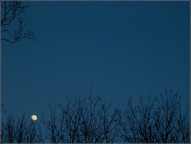
Curves to bring out shadow in moon, ums to sharpen the trees, added 2 tone border. I'm not happy with the trees being in the way, and hopefully it doesn't hurt me. We'll see! :)
Statistics
Place: 179 out of 492 Avg (all users): 5.4633 Avg (commenters): 6.5294 Avg (participants): 5.3737 Avg (non-participants): 5.5671 Views since voting: 1208 Views during voting: 415 Votes: 354 Comments: 20 Favorites: 1 (view)
From a technical standpoint this image is one of your best. What is great about it is that the moon is properly exposed with respect to the rest of the image and the fine detail shows up nicely.
Though you don't like them, the trees add considerable interest to the composition. The branch in the upper right isn't really a distraction so much as it makes the image seem unbalanced without a similar branch on the upper right side. It is debatable whether or not the tiny branches should touch the moon or not. Usually it is a little more eye appealing if they do not.
The sky color is a dull blue resulting from use of curves to bring out that great lunar detail. You could apply color painting on a 50% greyscale layer to bring out a deeper, darker blue that would make the moon stand out spectacularly and look great. It would also help mask the slight haloing around the branch detail. The sky is noisy and needs noise reduction applied.
I like this image, the tone of the blue is very pleasing indeed.
The branches in the top left corner are a distraction, there is certainly a temptation to consider cropping but I think this would be detrimental to the image, as the expanse in the upper two thirds of the image compliment the lower branches and moon. I would suggest the idea that it may have been worth considering an active inclusion of the tree to the left thus creating a nice framing effect for the moon.
Personally I'm not too keen on the border, I know that many people have different ideas on borders but for me it's simply a case that the border should passively compliment the image, although the border you have chosen it simple and neat I do find myself looking at it (especially along the bottom edge), therefore it is 'active' rather than 'passive'.
All in all it's a really nice shot, I think that it would look great printed.
Hope this helps and please feel free to send me a PM if you have any questions.
I like the texture that the trees give in this shot. And the blue of the sky is very mellow. If the moon were just a tad bit higher, I'd say perfection! So hurry up and move that moon already! :-) Great shot.
I think the use of color and brightness was effective in making your subject really stand out despite its being very small in the frame. For me the picture would be better if it wasn’t quite such a common scene. I like the shapes of the branches coming up from the bottom of the picture but don’t think the branches at the top add much to the picture (to me they take away from the picture). This picture might have more impact if you really boost the saturation to make the blue really intense and the yellow/orange of the moon really stand out more.
I really like the shot, the only thing that bothers me is the upper left hand corner. I might even say it's distracting. A crop to eliminate that might have improved it.





 Add photograph to your favorites
 Add photographer to your favorites

 Photographer found comment helpful.


