Author Thread Comments Made During the Challenge
Post actions
Nice composition, at first I thought it was some kind of face though.
Post actions
Post actions
B & W works well here, and I like the offset comosition of this shot.
Post actions
Post actions
like the picture, not crazy about the text.
Post actions
Post actions
Nice composition and good lighting. The text is a perfect fit for the ad.
Post actions
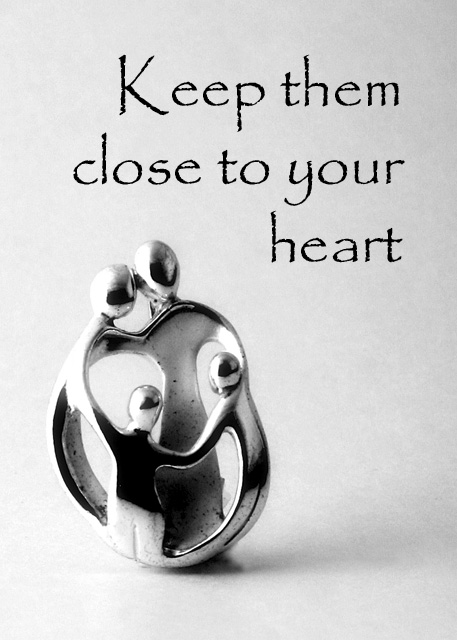
Nice written words. I like the font you used. This looks good desaturated also. And I like the message it puts forth. 7
Post actions
First imaige I've seen that kinda wants me to dig in my pocket, and I'm one cheap SOB.
Post actions
I like the composition and lighting. Good choice of text, works very well for this image. Would like to see this make top 20. Good luck.
Post actions
Had to study the object to figure out the title. Nice. Might be better if a bit lighter background and more light directly on the subject.
Post actions
A very nice presentation. My tiny complaint is with the blown parts of the subject. However, the overall look is pleasing with good use of background. Bumping up
Post actions
Lovely sculpure. Nicely photographed. Text is very tastefully handled.
Post actions
This is a nicely presented ad. Nice comp and font. However I don't get that this an ad for jewelry, maybe family values or religion.
Post actions
nice little 'thing". Although i'm not sure what it is, I'd guess its a kind of neckless of some kind. The Item feels dirty unfortunatly (inside) and is slightly out of focus. The Font used is interesting, but for some reason, i don't find it appealing; perharps because it feels as dirty as the item?! 6
Post actions
I really like this photo. The image created touches the heart, good job!
Post actions
Nice - not quite sure what it is, but nice! Not a traditionsal jewellery shot - is this a brooch?
Post actions
nice..simple...elegant...emotional..i like...7
Post actions
Cute, black section seem a tad strong.
Post actions
Awesome!!! Would make a great advert
Post actions





 Add photograph to your favorites
 Add photographer to your favorites


 Photographer found comment helpful.


