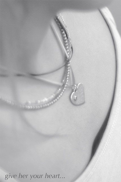
Taken in my friends room. Desaturated. Unsharp mask, added a blur layer, curves, levels, duotone, text.
Thank you for all of the comments on this picture. They have all been helpful. However, I would like to state in my defense that this was actually a candid shot, I wasn't going for anything really on it. A day before the challenge deadline I noticed that this one had jewelry in it, so I fixed it up and submitted it real quick.
Statistics
Place: 91 out of 159 Avg (all users): 5.3360 Avg (commenters): 5.8621 Avg (participants): 5.1683 Avg (non-participants): 5.4521 Views since voting: 843 Views during voting: 375 Votes: 247 Comments: 33 Favorites: 0
Ohh...I could almost see this as a real ad. There are only a few things that I would prefer to see adjusted, but the composition is very nice. I like the angle and the framing/cropping is also wonderful.
The one thing I would like to see is a bit more contrast, as others have mentioned, this is a very 'grey' photo. No real blacks.
Second, I would have removed the necklace that looks like a huge rubber band.
The last thing I'd like to see differently is the strand of blurry hair over the left side of the photo. In my opinion it adds nothing to the photo and creates a distraction over the necklaces.
Other than those minor things, I think the image is beautiful. The focus doesn't bother me. It has a nice soft feeling to it.
The angle is what has won me over though. Nice dramatic angle giving this much visual appeal in my eyes. Good shot.
~Heather~
one of the best composed, creative, and interesting shots in the challenge ... i think i understand your DOF softness intent ... just not sure if plane of sharper focus would have been better at pendant instead of lower right
I think b&w is not necessary here; it remove the contrast of the skin and the neckless. Also, I am not particularly fond of photograph where poeple got theire head choped off the frame.
I feel that the shot would stand out more if the jewelry piece is highlighted better. As it is, it feels too neutral and doesn't stand out as the primary subject of the ad. the shadow on the shirt neckline is a bit distracting as well, imho.
Very nicely done.
Wasn't sure I liked it at first, but the longer I looked at this, the more I liked the soft & subdued look to it. Text/font works well here.
The softness is alright for this one. It does seem asthe focus is missing the mark but it adds a romantic feel to the picture. Would have been a higher score without the chin or more of the face. Either one would seem more purposeful to me.
The idea is nice, unfortunatly the composition suffers greatly. Lower Left shows a bit of cloth which is bugging, especially since its so obvious with the text over it. The Focus is not sharp enough, not giving the jewel enought attention. Also the number of neckless is, although normal and 'natural', doesn't help the jewel to stand out. 5
focus is more on her shirt than on the jewelry..IMO this might have been a better photo if it were in color and focus moved up a bit to draw attention the the jewelry..good caption...orginal





 Add photograph to your favorites
 Add photographer to your favorites

 Photographer found comment helpful.


